A Refined Docs Assistant Experience
Duration
05/2024-07/2024Team
Product ManagerFront-end Engineer
Role
UX Designer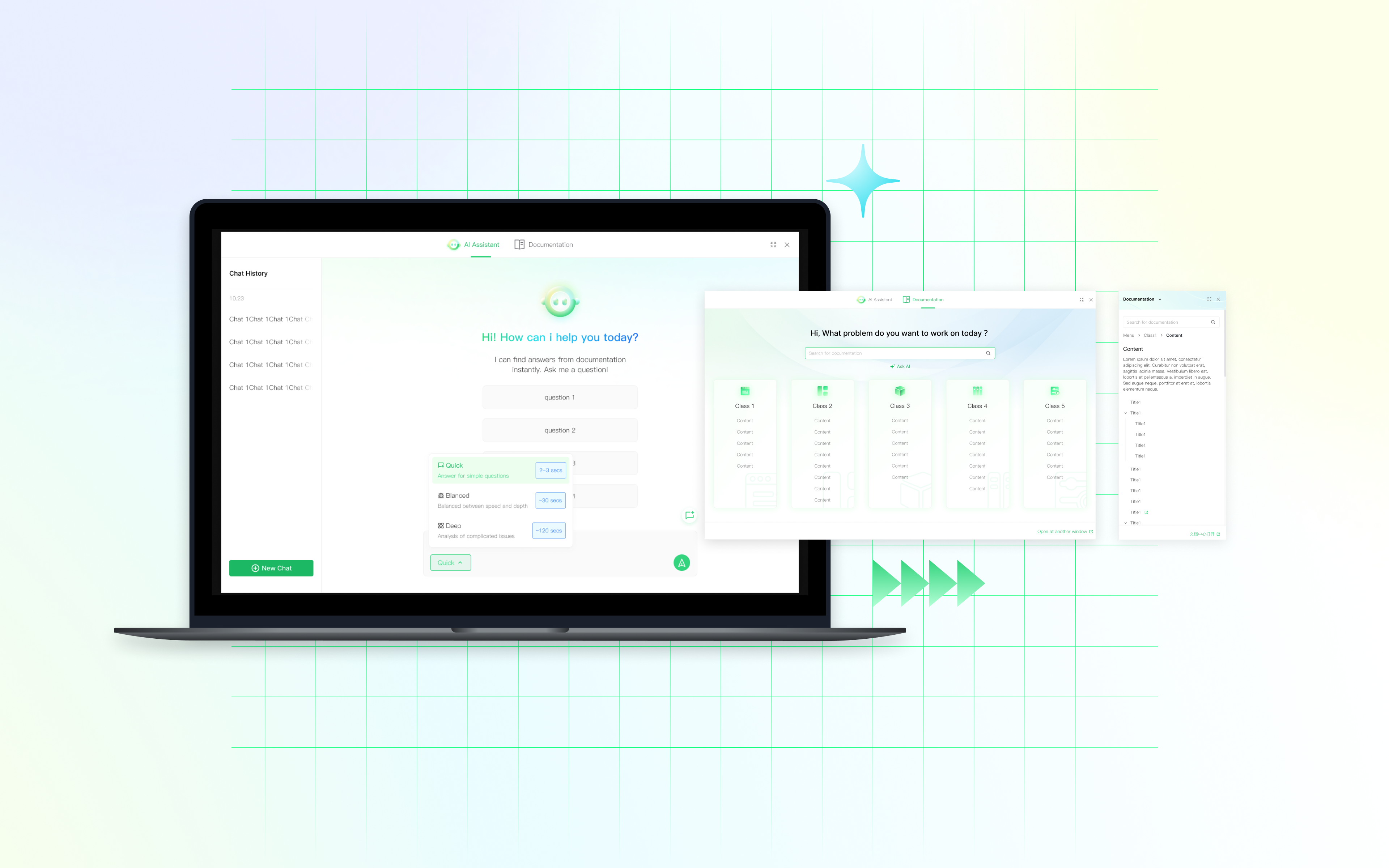
Overview
During my internship at a startup focused on Product-as-a-Service (PaaS) and Model-as-a-Service (MaaS) solutions, I had the opportunity to design a documentation assistance window that enables a more efficient and intuitive learning and search experience for users.
Our team aimed to streamline the user experience of discovering and navigating official documentation. I led the design work as the primary product designer, collaborating closely with a front-end engineer and a product manager, while receiving mentorship from a senior designer.
Problem
Because the product requires a high level of professional knowledge, users often struggle to efficiently find solutions to technical problems while using the product. Although official documentation is available through a dedicated webpage, the lookup process frequently interrupts the user’s workflow, resulting in friction and reduced overall product efficiency.
Solution
An efficient assistant window that supports user’s search experience based on different kinds of demands.
Jump to final design︎︎︎
So...
How did I get there?
It starts with...
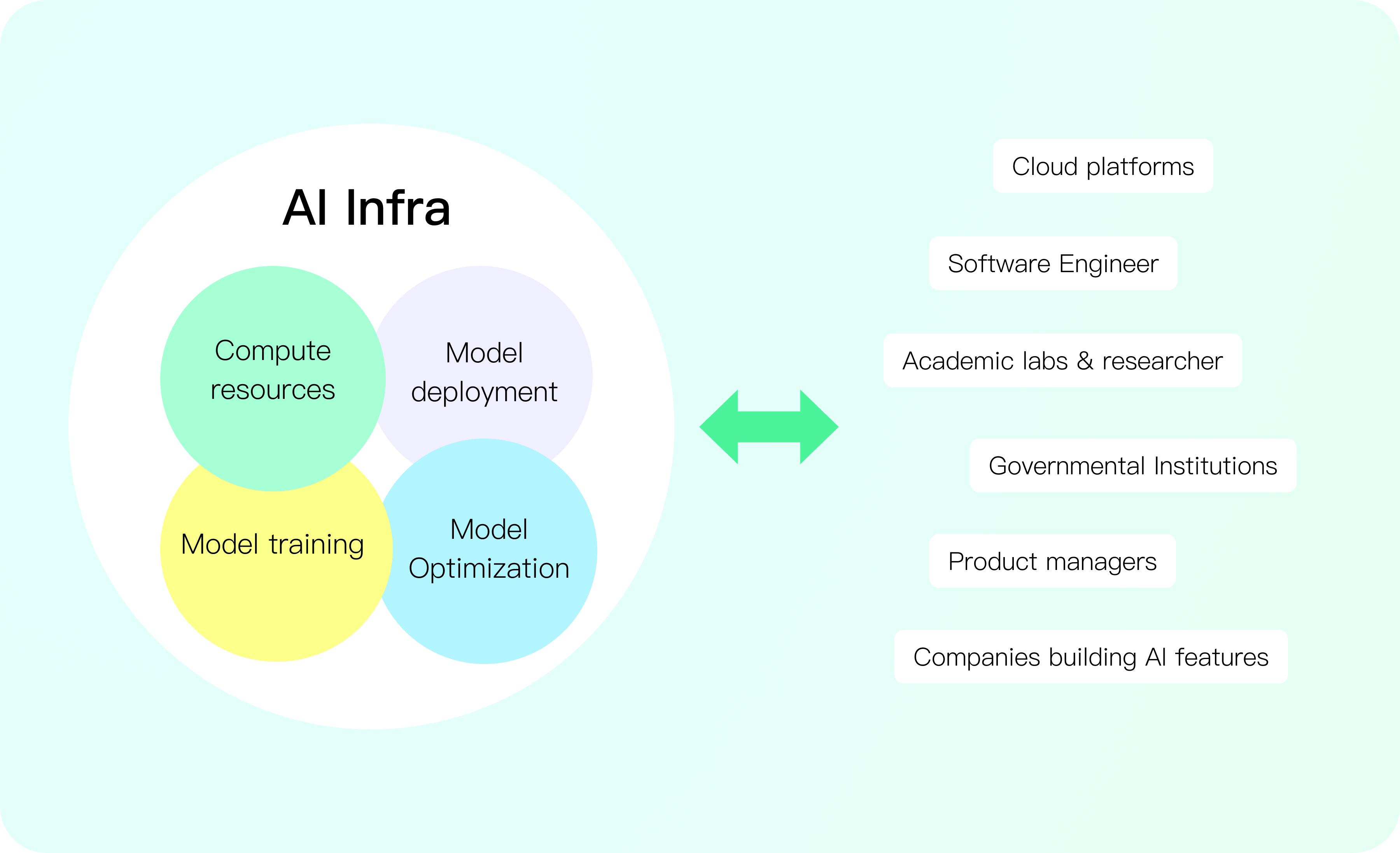
Background
A model-training and computing power management platform for users working with complex, technical workflows.
As a result, the documentation site becomes a frequently visited resource. To help the product stand out within its ecosystem and improve overall usability, it is essential to upgrade the documentation search experience.
Research
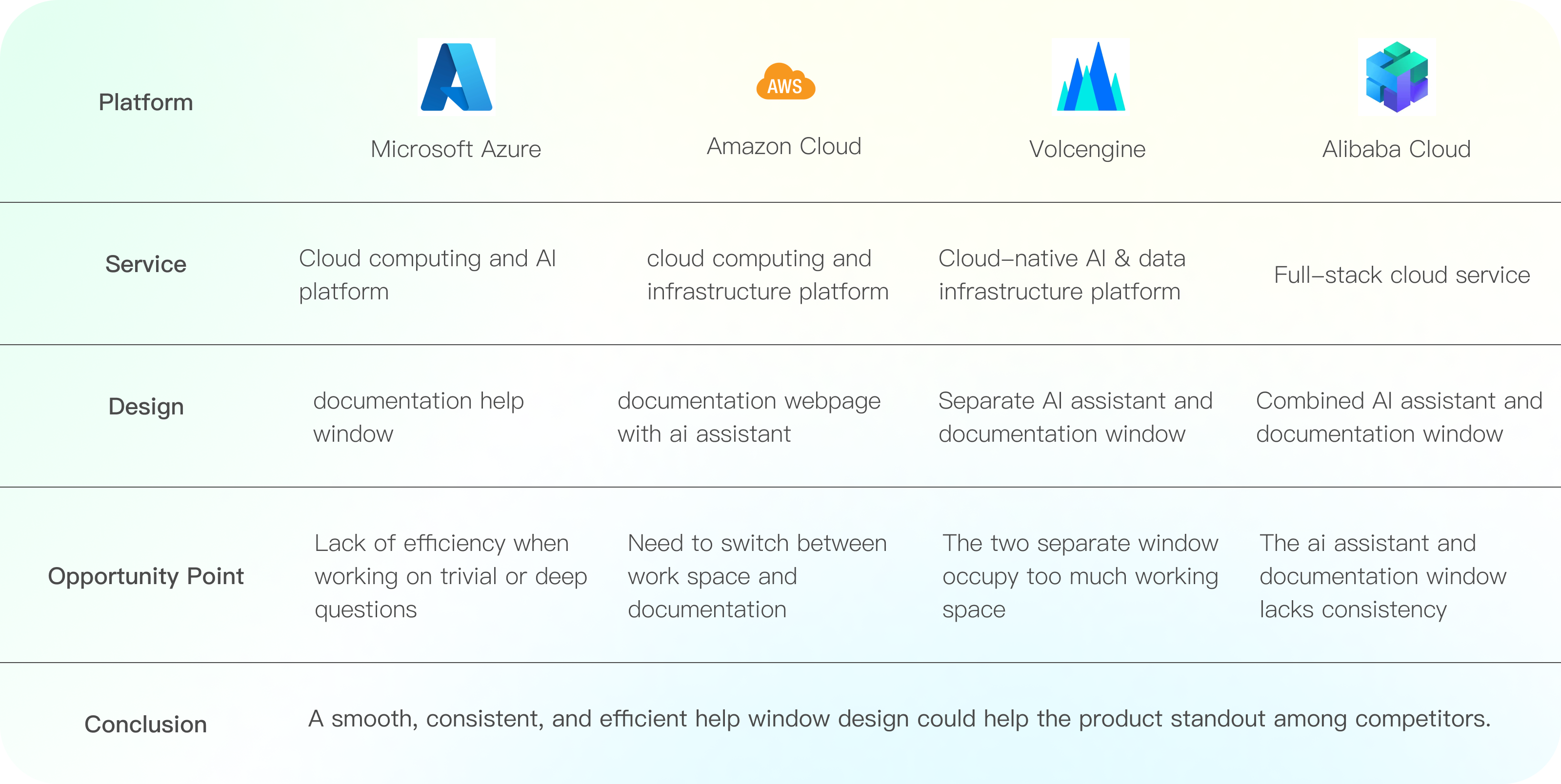
Competitive Analysis
User Research
Internal research shows that the documentation webiste is not efficient enough in solving user’s operation problems, especially when the issues are trivial.
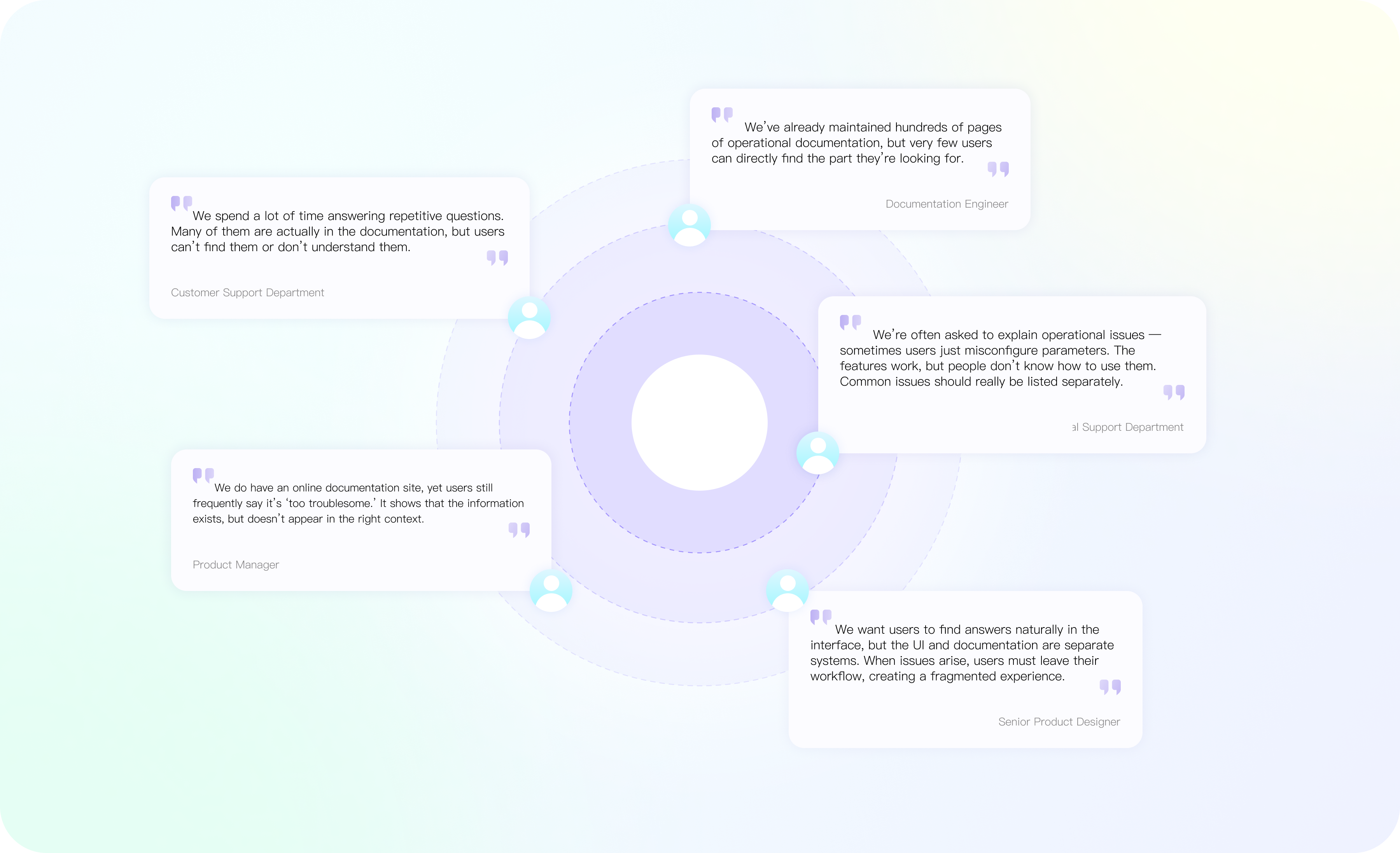
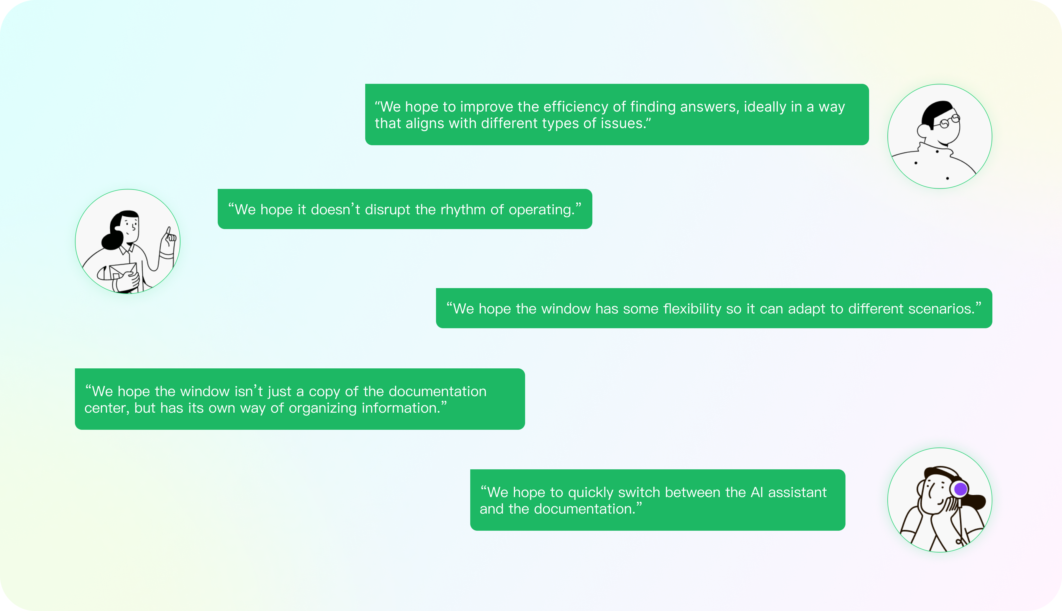
External user interviews show that the users value flexibility of the feature the most.
Statement
Research shows that the users expect the feature bo be:
1.
Flexible and intuitive, adapting to different contexts and user goals
2.
Naturally integrated into the product workflow, minimizing disruption during task executio
Design Principles
Our users need docs assistant that:
🧐
Prioritize Findability Over Volume
Design for easy discovery—shortcuts, filters, smart search, and categorized common issues—rather than relying on large documentation pages.
🚀
Enable Fast Switching Between Help Sources
Allow seamless transitions between the AI assistant, documentation, quick tips, and examples.
🧩
Adapt to User Scenarios with Flexible UI
Allow the help window or assistant panel to resize, reposition, and adapt to different tasks without disrupting the user’s working rhythm.
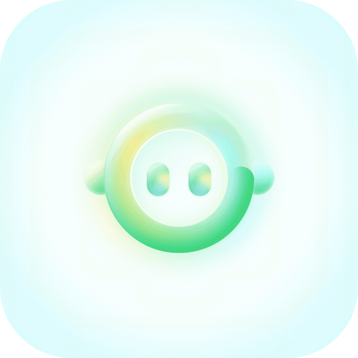
Visual elements
A freshing and friendly supporting visual system
Iterations
Iteration 1
Floating window vs. Side window
In the first Itaration round, I contemplated upon the form of the UI. Both floating window and docked window appears with pros and cons as an assistance form.
Floating Window
-Overlays upon existing UI
-Flexible & Draggable
Docked Window
-Occupies a fixed position on thescreen
-Pushes the existing UI to the left
I prototyped both form out and present them to the product manager team to gather feedbacks. We ended up with the docked window design due to:
1. Floating window blocks the view of the operation UI, which would influence the efficiency.
2. Competitors favor the floating UI design tue to its conveniency in front-end develpment, making the docked design helps our product standing out by providing a smoother experience.
Iteration 2
Finding the correct form of info layout for expanded mode
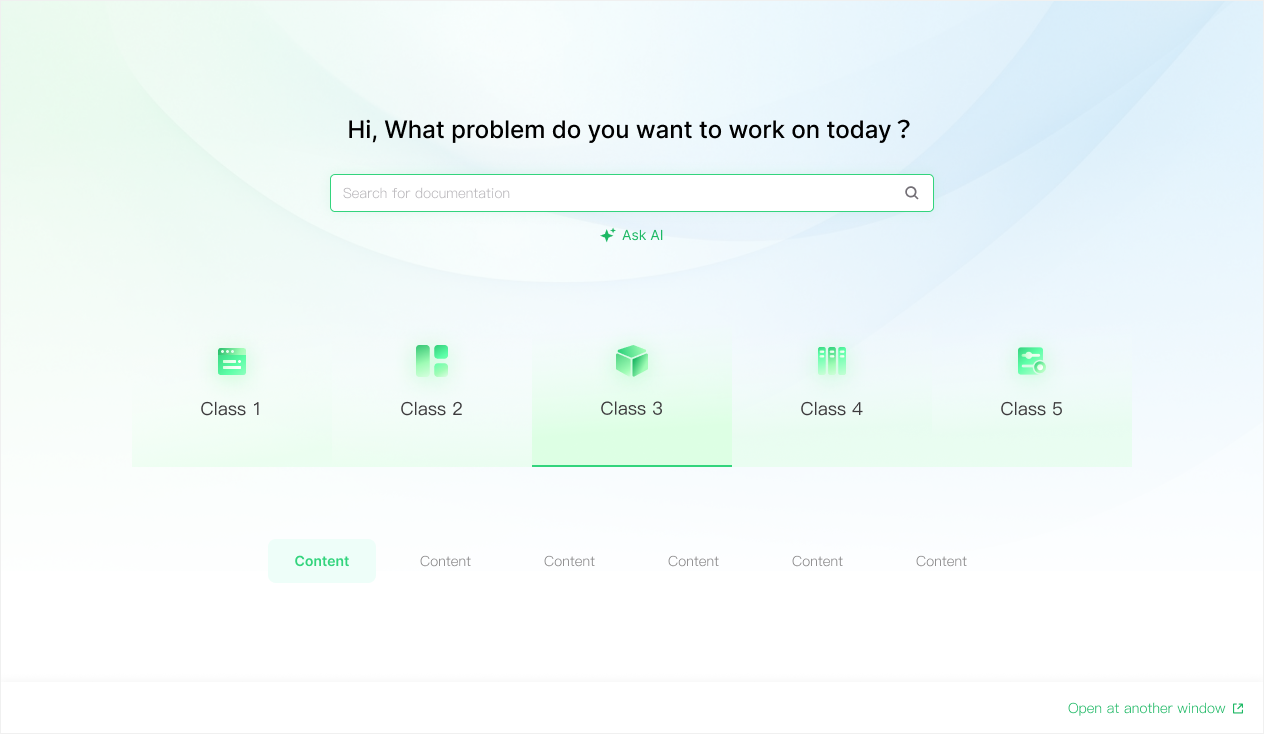
Layout 1
-Highlights categories
-Subtitles only appear when the major category is selected
Layout 2
-Present all the content at once
-Occupies more space on the creen
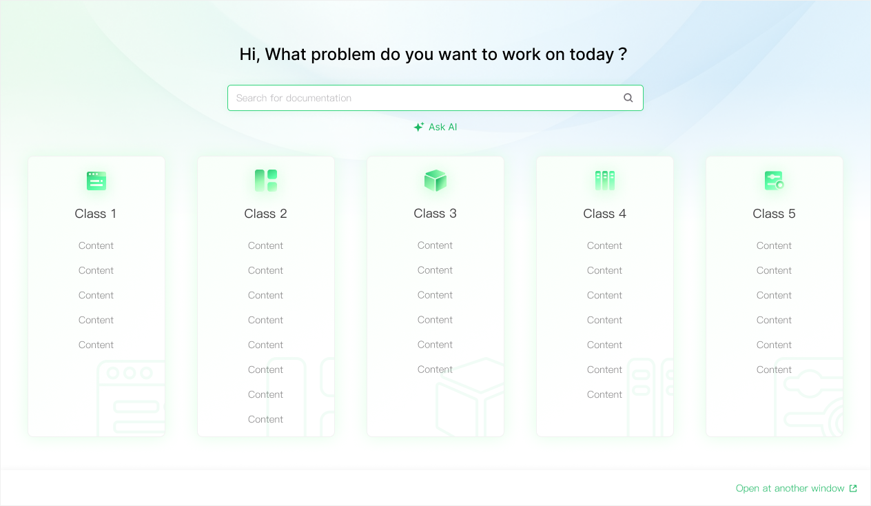
I voted for layout 1 due to it’s simplicity, while the product team voted for layout 2 for it’s straighforwardness. After discussion, we settled on layout 2 considering it is more direct for users to find what they intend to work with.
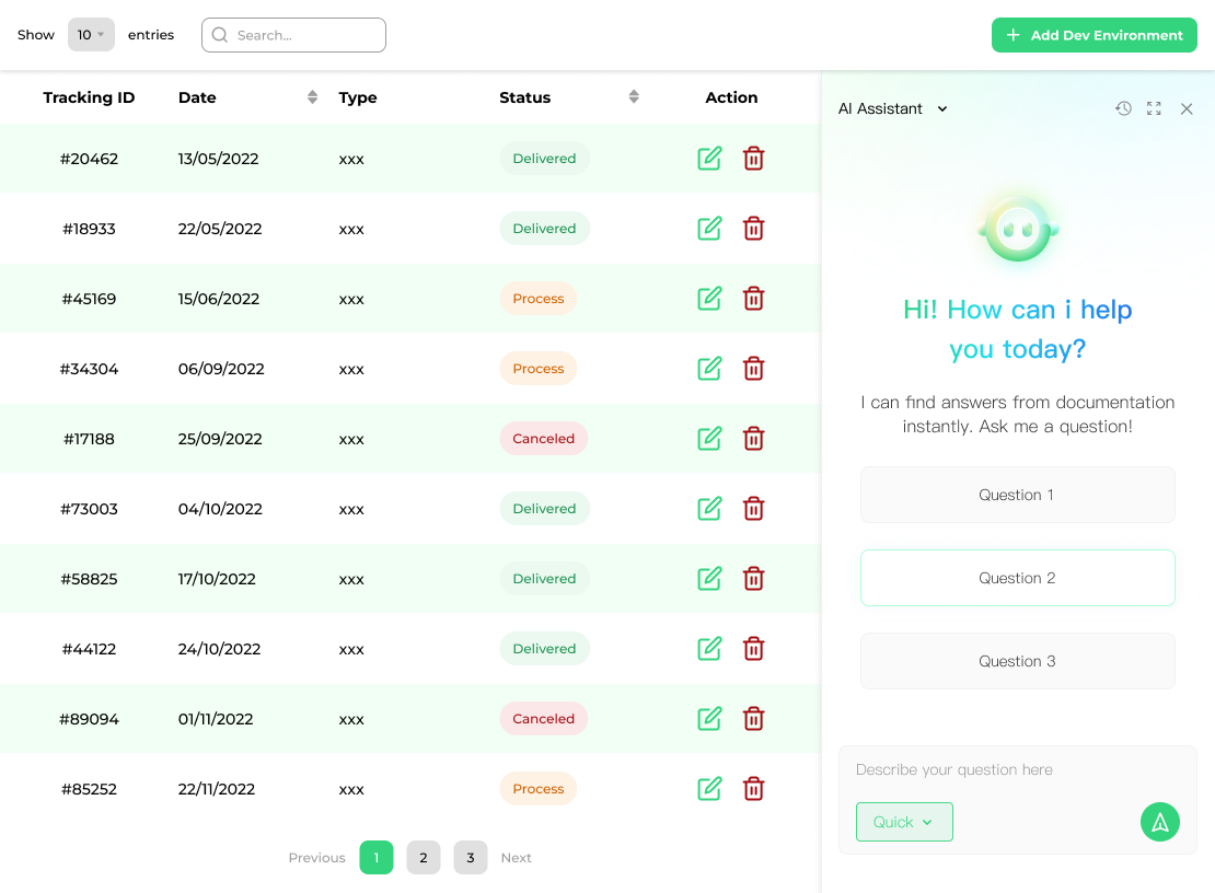
Constraints
How to achive non-disruptive Integration?
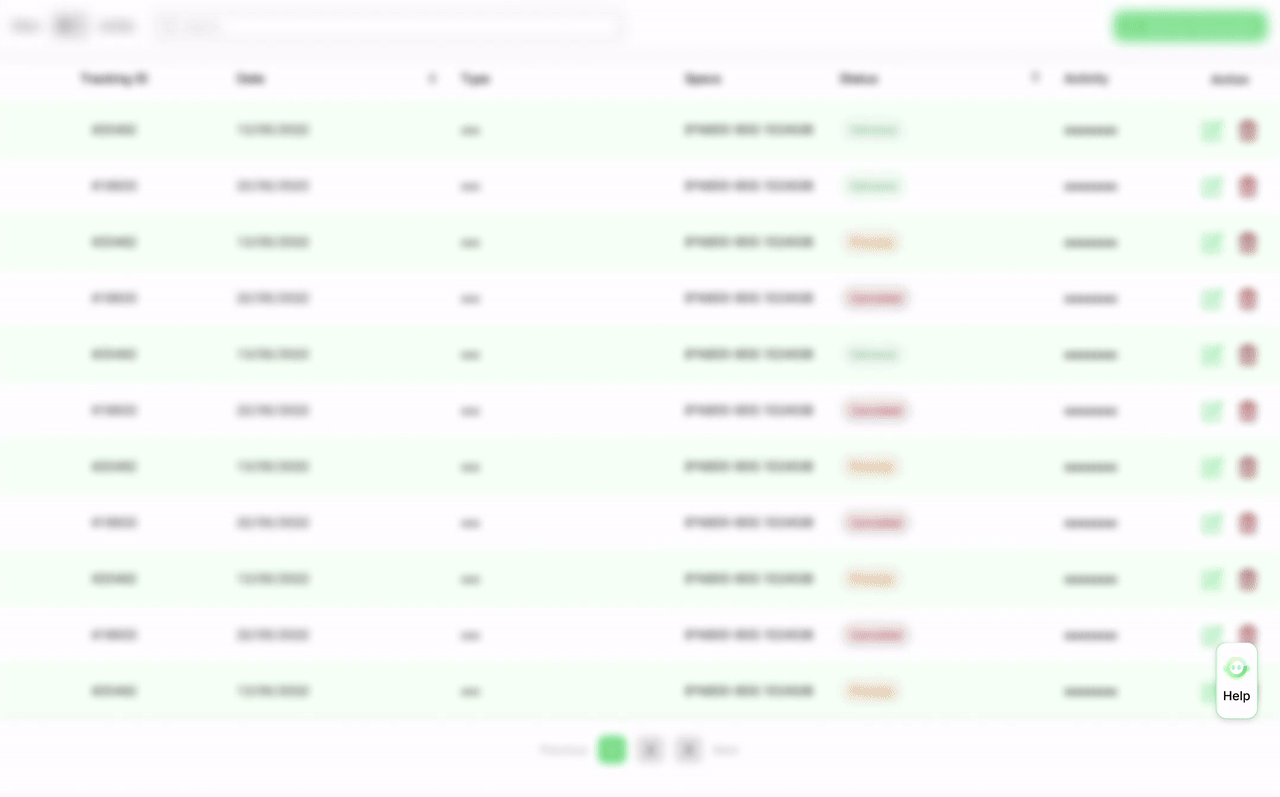
Using the docked window design would push the existing UI to the left side and lead to less space for the original UI content. For types of UI like dashboards, this could cause inconvenience since everything are pushed together.
This is how it might looks like by pushing all the elements to the left, and it’s even harder to read when there are more infos in the original form.
So...What’s the solution?
To make a smooth dashboard experience, I figured out a pattern to adapt the new UI layout. While the action coloumn stay fixed on the screen, the other infos would be presented in their original layout and controlled by a slider for the users to view. This pattern is better than squeezing the original dashboard narrowers because:
1. The action coloumn remain undisturbed and prioritized.
2. The users doesn’t need to review all the infos in the dashboard at once, mostly the first couple column would be enough.
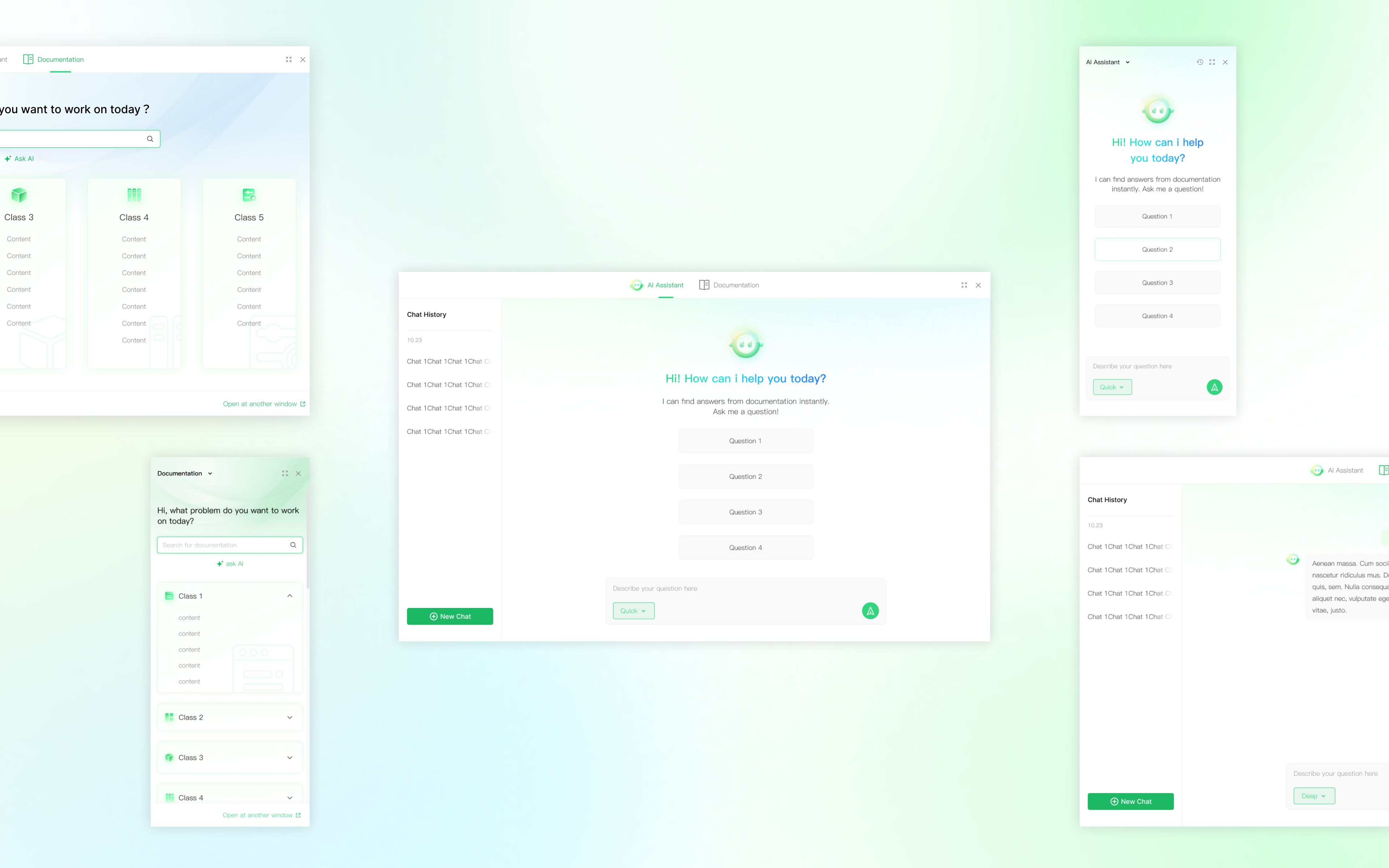
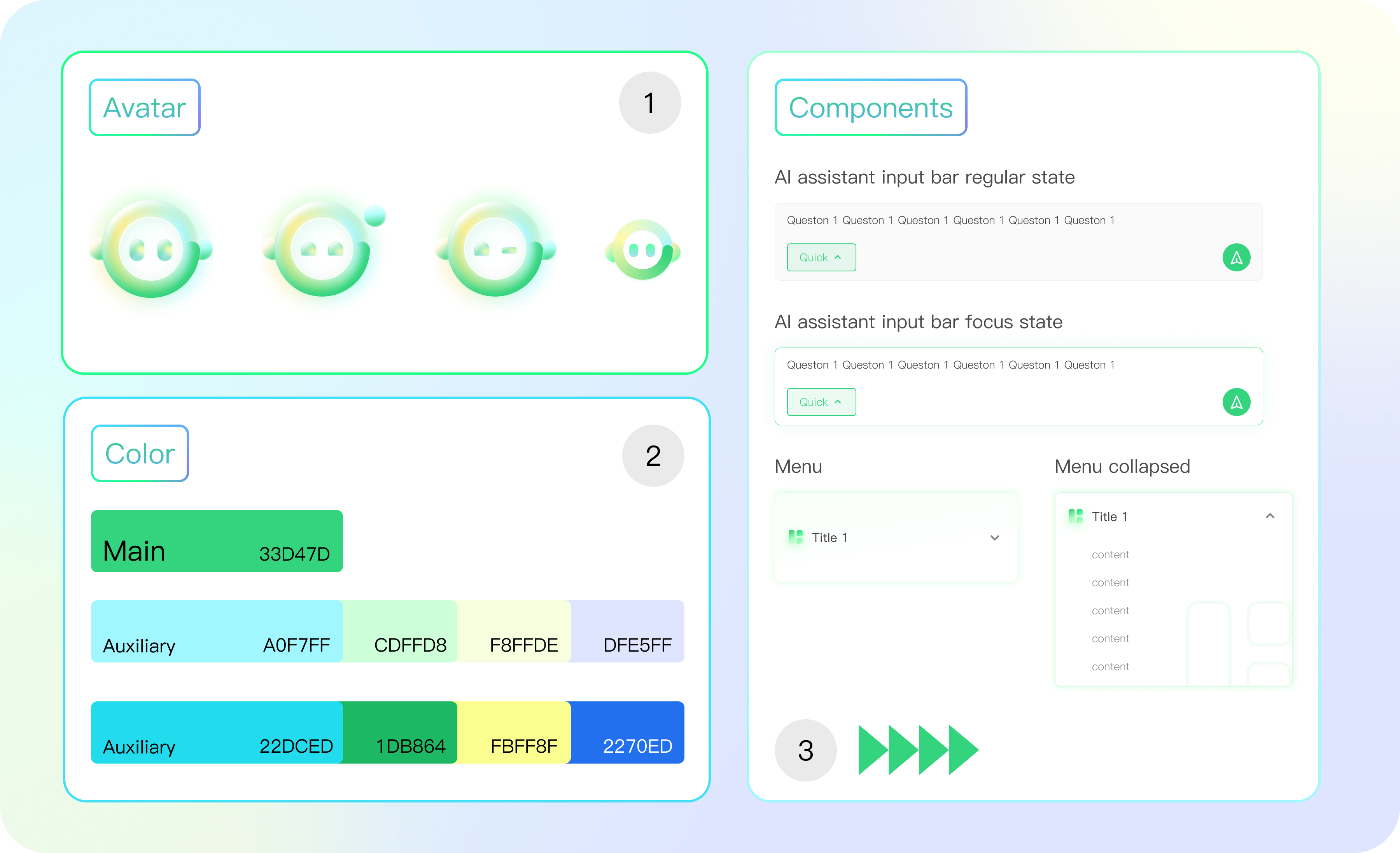
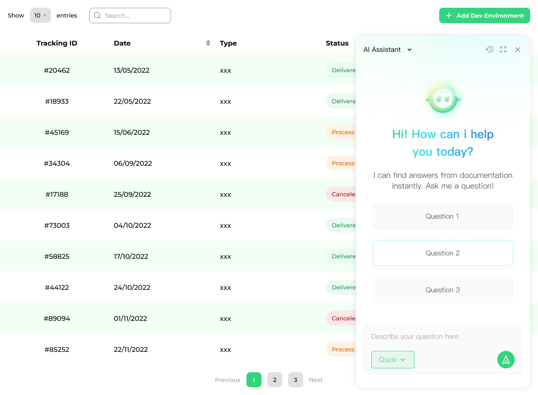
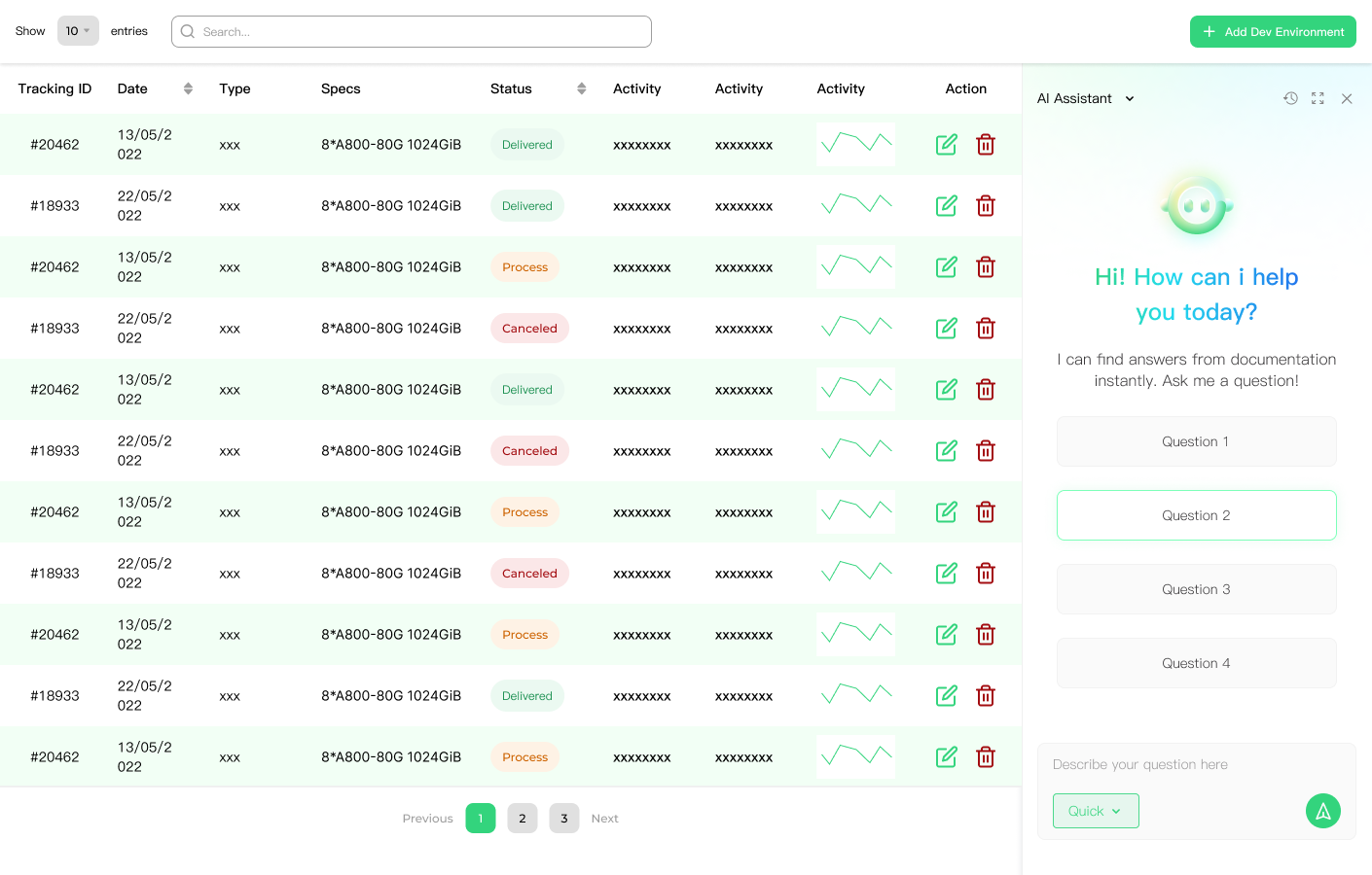
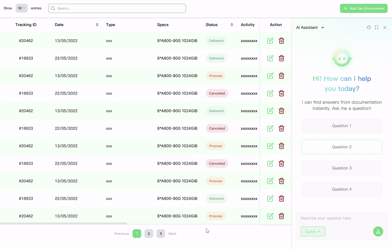
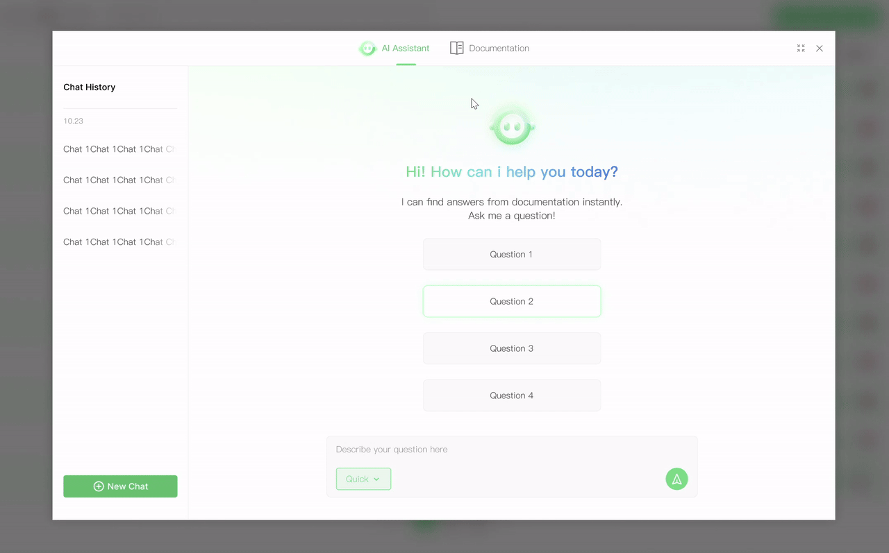
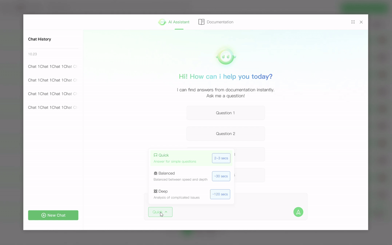
Final Designs
A seamless assistance experience that
Changes its position & shape based on your work demands without disturbing your operation
- Providing instant support when operating the product, always prioritizing the action column so the user don’t need further act to switch between reading and operating
- Allowing both docked view and immersive view for different reading demand

Allows you to switch between conversational assitance and immersive documentation reading
-Quick search for contents where the users are ware of how to find
-Chatbot assistance for questions that the users are unsure about

Smoothly helps you with solving your problem by different response modes
-Quick, balanced, and deep mode would cover different user scenarios by solving questions with various levels of details.

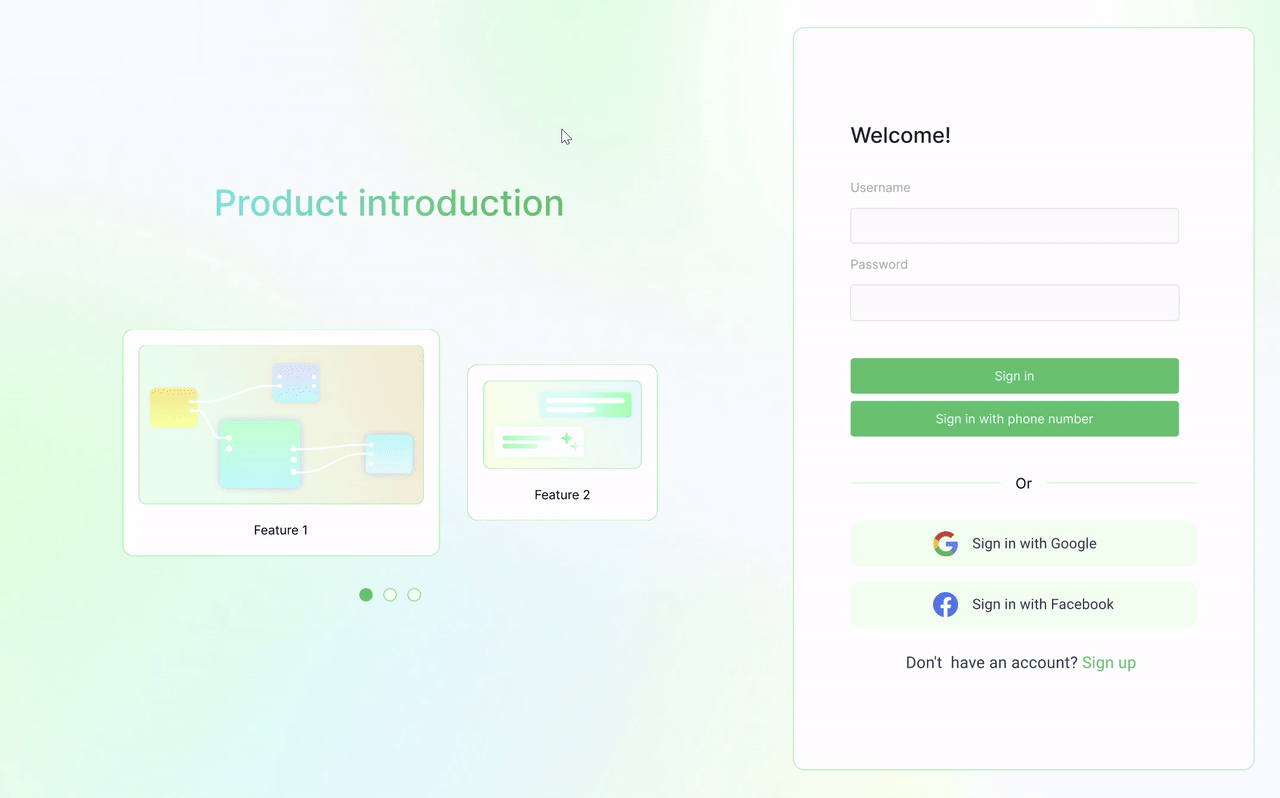
A set of re-usable visual identity for webpage & marketing materials
-The color palette could be used to upgrade the visual identity system of the product, official webpage, etc.
Impact
After improving the assistant entry point and adding contextual prompts, 32% of weekly active users engaged with the AI assistant within the first month.
Previously, users relied on manual searches that took approximately 3–5 minutes. With the AI assistant, users were able to reach relevant documentation or answers in under 2 mins, significantly improving workflow efficiency during product usage.
Takeaways & reflections
1. toB vs toC 💡️
The difference between toB and toC design is often overstated. ToB product also values visual aesthetics, clarity, and empathetic design as it helps building brand identity and user trust.
2. Bringing help under complexity 🙏️
There are more space for customization about designing a help system that my expectation. The more complex the operation flow is, the more design possibilities would appear in the process. Upon familiarity about successful UI patterns, designer needs to learn about each step themselves before shaping a solution.
3. How would AI assistance belike in the future 🤖️
I started to ponder about how might the documentation assistance experience be like in the future with AI. The role of such assistance tool might evolve into co-working partners which could auto-detect the user’s progress and intent, offering contextual and personal support.