SO-NOI
Duration
02.2023-04.2023Team
Solo Project︎Role
Product Design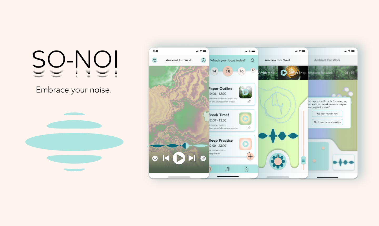
SO-NOI is an app that provides music based intervention in helping their users to stay focus with tasks they wish to concentrate on and achieve a long term effect of reducing anxiety. It aims to provide services that help the users who loves music to spend their time efficiently and develop habits of staying concentrated. Multiple modes of interacting with music is employed in the product mechanism, binding the users deeply with the potential of music for a aesthetically-enriching and accessibly journey to better well being. SO-NOI proposes a life philosophy of embracing and co-living the noise in our life by focusing better in ourselves.
View the prototype here︎︎︎
Context & Ideation
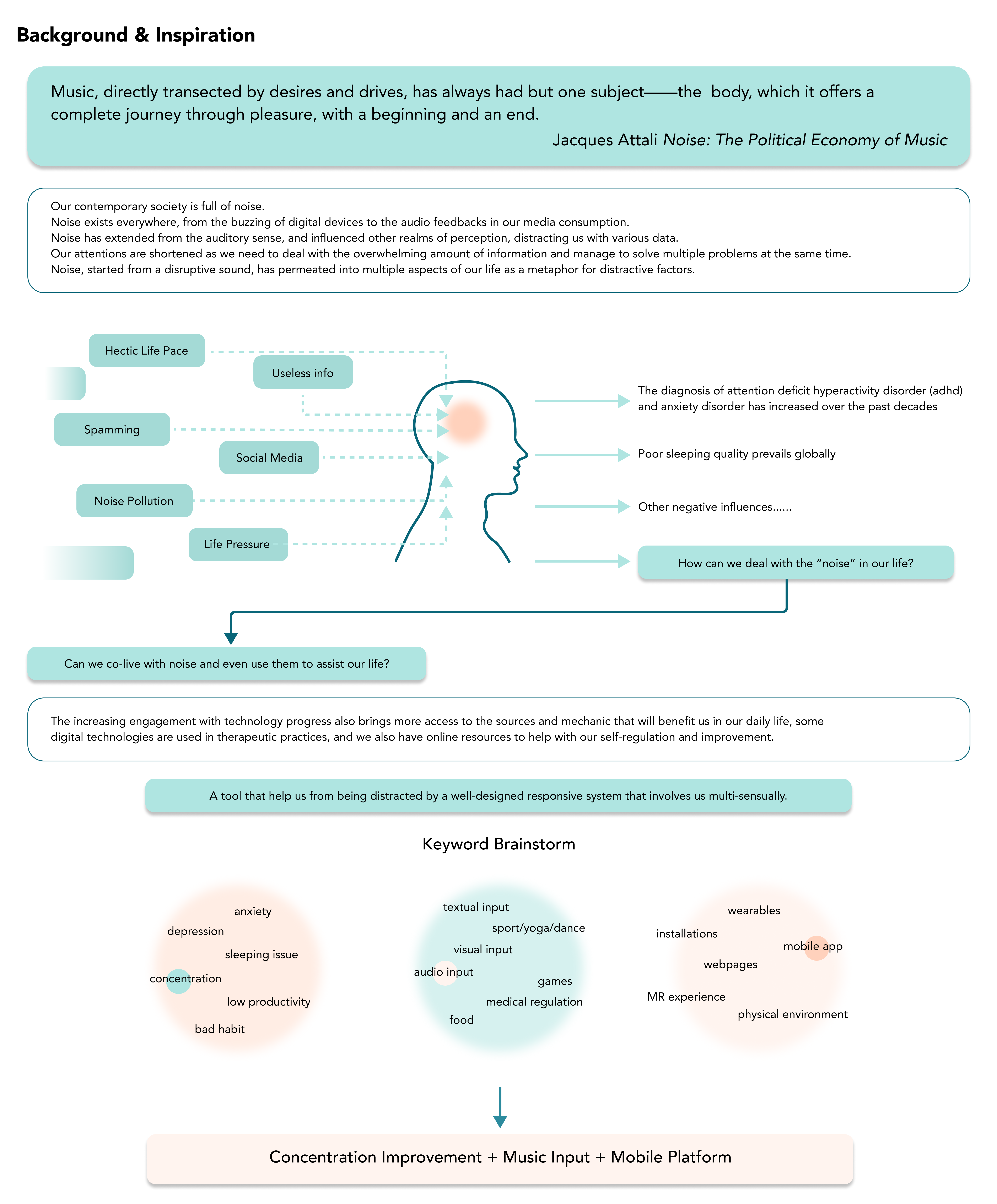
The idea of the project comes from my observation with my peers or other professionals who has a relatively flexible work & study schedule. Many of them has problem in managing their time efficiently, sticking to their plans, or concentrating on goals they hope to achieve. Some of them share a tendency in adhd and anxiety. Understanding this a general condition for people living and working in contemporary society, I decide to conceptualize a product to help people who has similar frustrations.
Research
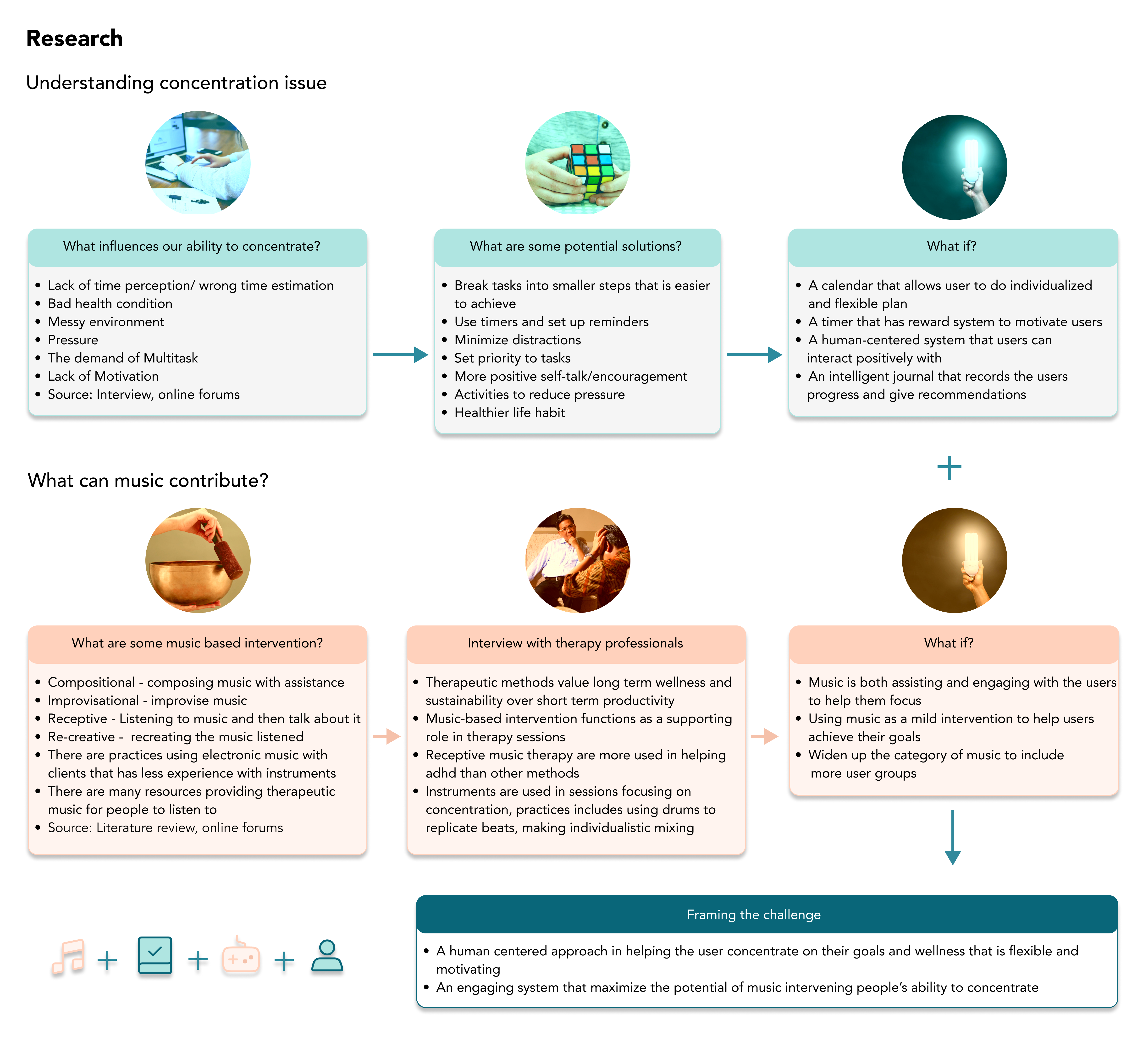
My initial research contains gathering information from online forums, reading related materials to build an objective realization in how such issues are formed and their potential solutions. I also searched for practices in music therapy and music based intervention and interviewed professionals in mental health therapy for details and directions.The research further helps me setting up the concept of the project.
User Research
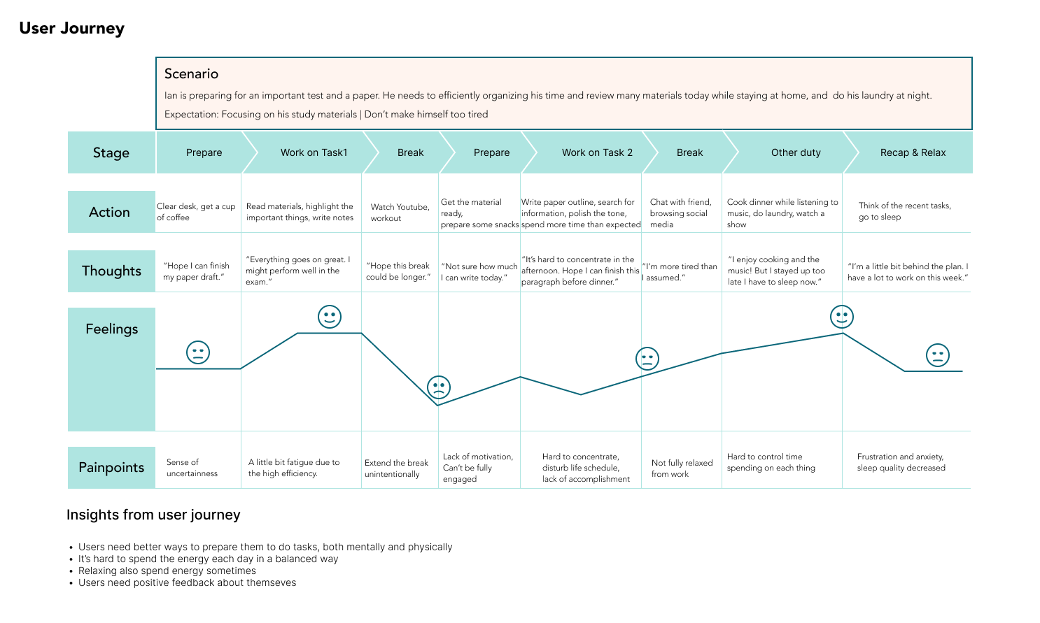
After the initial research I got a better understanding about the problem and conducted several interviews with potential users to learn more about their life patterns, frustrations and personal interests to discover design opportunities.

Second-phase Ideation
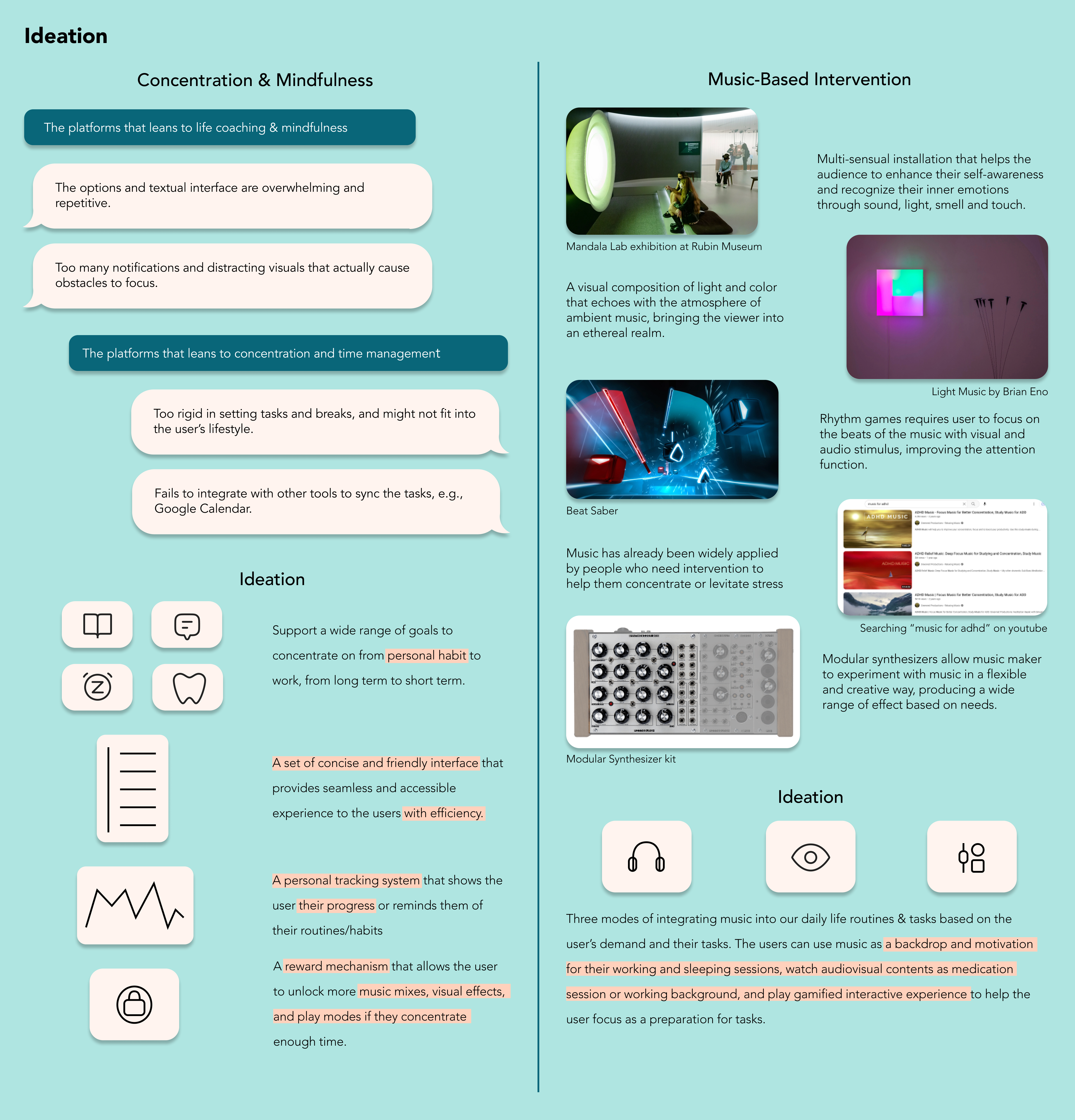
The research helps me building an insight about the problem and potential users, which allows me to continue ideating the project in the perspective of functionality and mechanism. I took inspirations from some artistic and entertaining music based interventions as well as looking into many other products that focuses on mindfulness and concentration.
Low-Fidelity Prototype

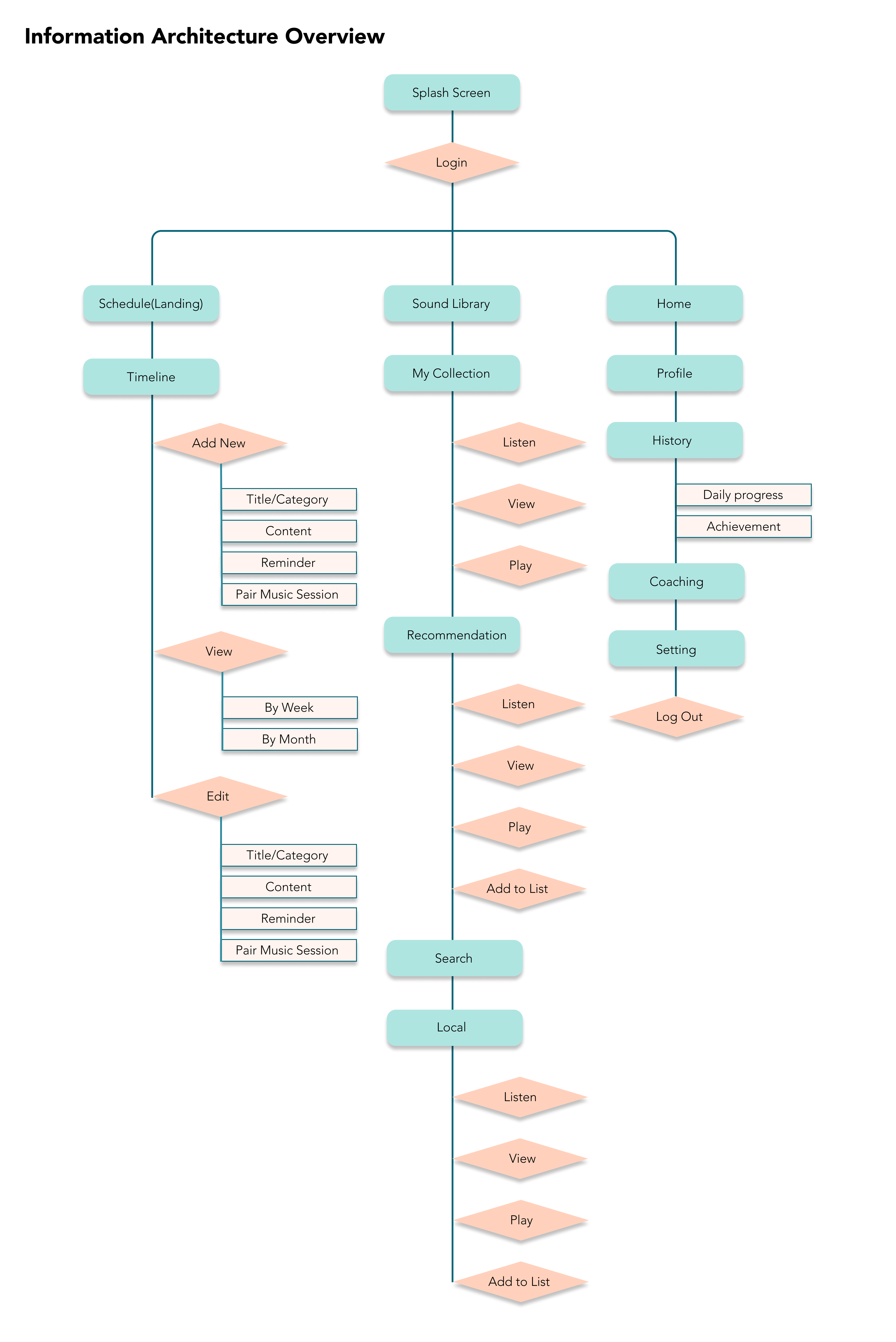
Information Architecture
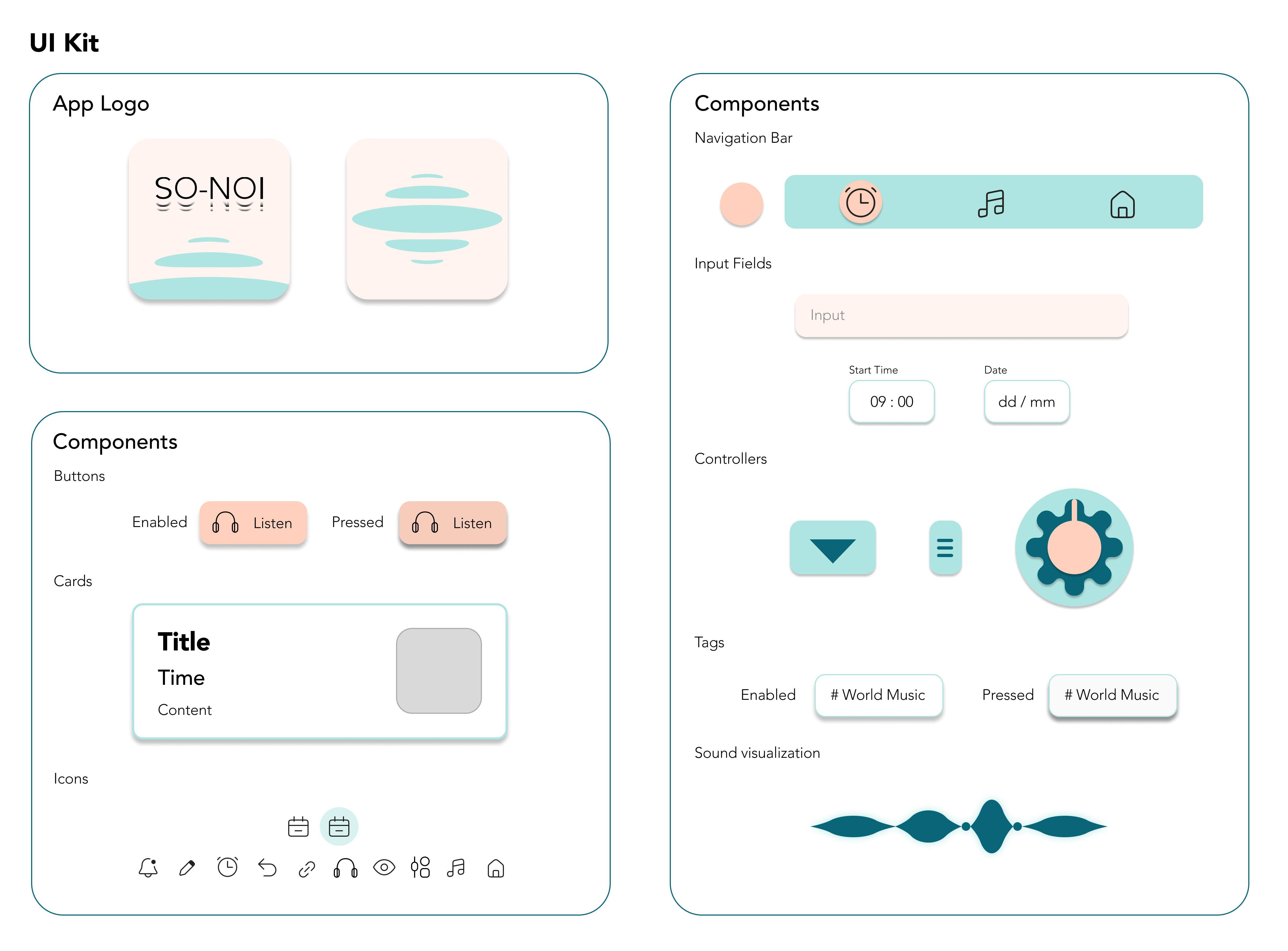
Visual Identity & UI Kit


Prototyping
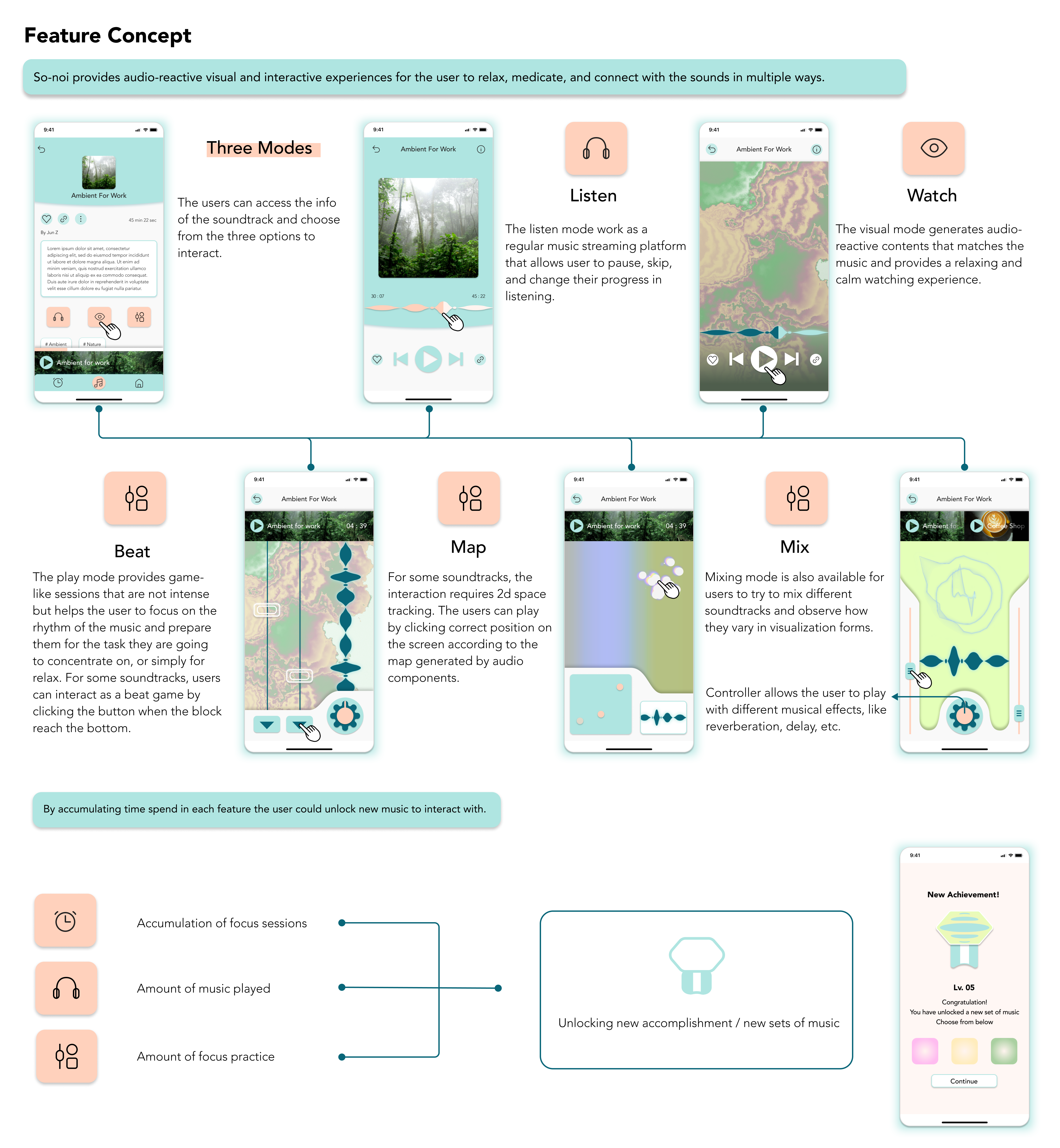
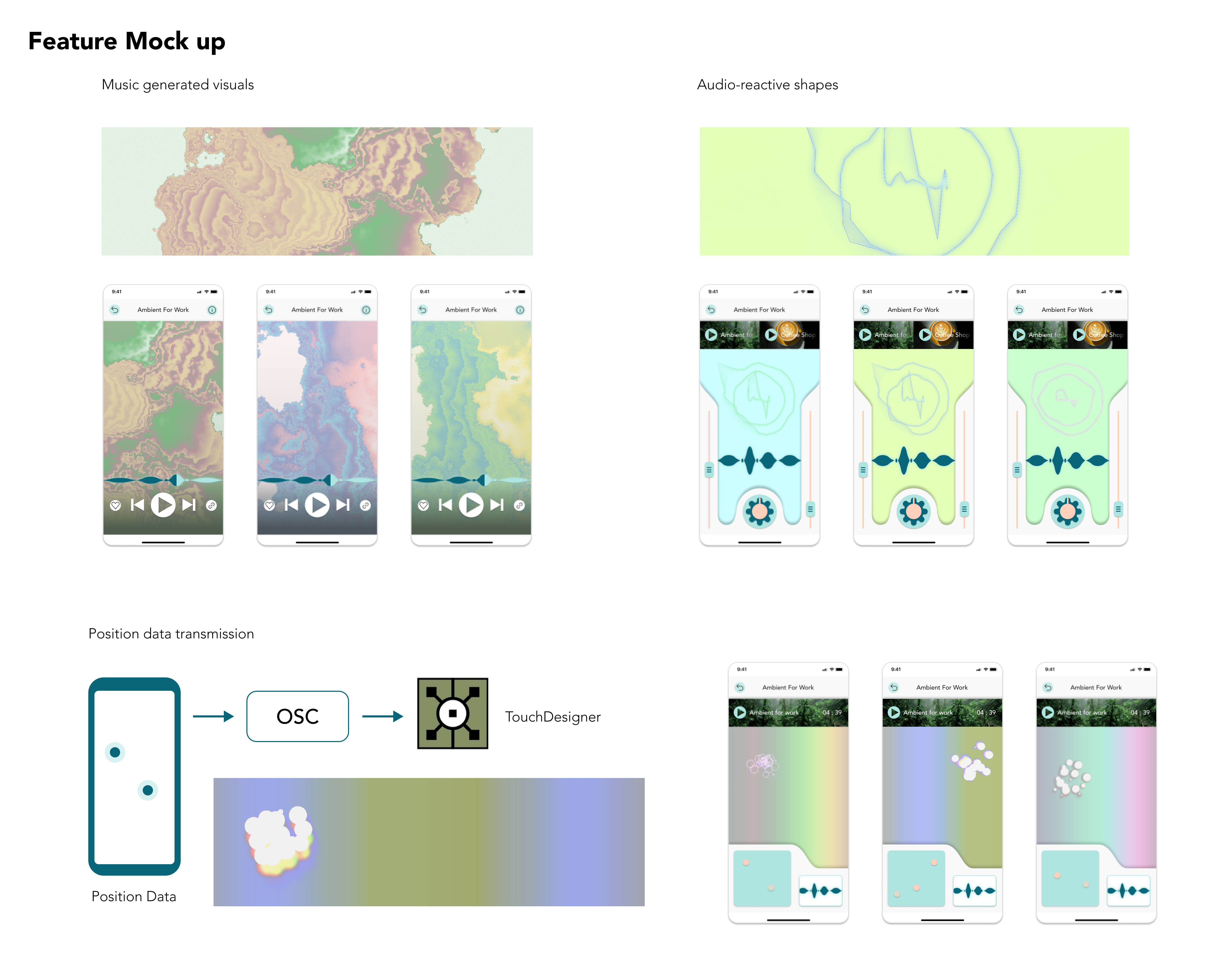
To create the intended visual effect and interactive mechanism, I used TouchDesigner, a node-based visual language programming language to make demos for mockups and user testing.

Usability Test & Iterations
I conducted several user testing and made iterations to make the experience more user-friendly and accesible without complicating the design.

Final Screens

User Storyboard
While we already analyzed how Ian spend a typical day in work and life, I made another storyboard with a hypothetical scenario of Ian using SO-NOI to demonstrate how it works and engage with user’s life. Illustrations are generated by Midjourney.

Extensions
While SO-NOI is a conceptual project, I still situates it into a close future in which more emerging technologies could be integrated with SO-NOI and optimize the experience and other possible applications of similar designs.

The Takeaway
Takeaway #1
Designing for mindfulness need to be balanced in order to makes the product inclusive and reach more potential users. Emotional design also counts a lot in such projects as positive feelings motivated the users to continue their interaction and results in a positive feedback loop.
Takeaway #2
Although most UI/UX design focuses on a screen as the agency for interaction to happen, the process could include more dimensions of percetions than it seems to be. Subtle usage of those sensations could contribute to a pleasing multi-sensual interaction experience.
Takeaway #3
Concise and simple designs sometimes have a high demand for a thorough user testing process to make sure the simplicity does not lead to any lost in functionality or smoothness of interaction. I would like to have the prorotype tested with people from more diversified user groups if I have the chance.