Mnemosyne :
Building Urban Memory
Duration
12.2022-01.2023Team
Solo Project︎Role
Product Design
︎Intro
Mnemosyne is a conceptual app design for users to create location-based interactable augmented reality experiences. Shared experiences count a lot in the establishment of a community within a multi-layered society, no matter it’s a cultural community or social community, a large one or a small one, as we could find from the public art programming and space design in multiple levels. Such experiences could be strengthened with emerging medias like AR and integrates with the digital side of our life, making both the creation and the expansion of shared experience more accessible to people. Mnemosyne stands for the goddess of memory, and allows users to interact with memories and makes it part of the physical and social context we are living in.
The project ides is inspired by the same name AR experience Mnemosyne AR︎︎︎
Skip to the output︎︎︎

Project Final Screens
Discover
︎Challenge
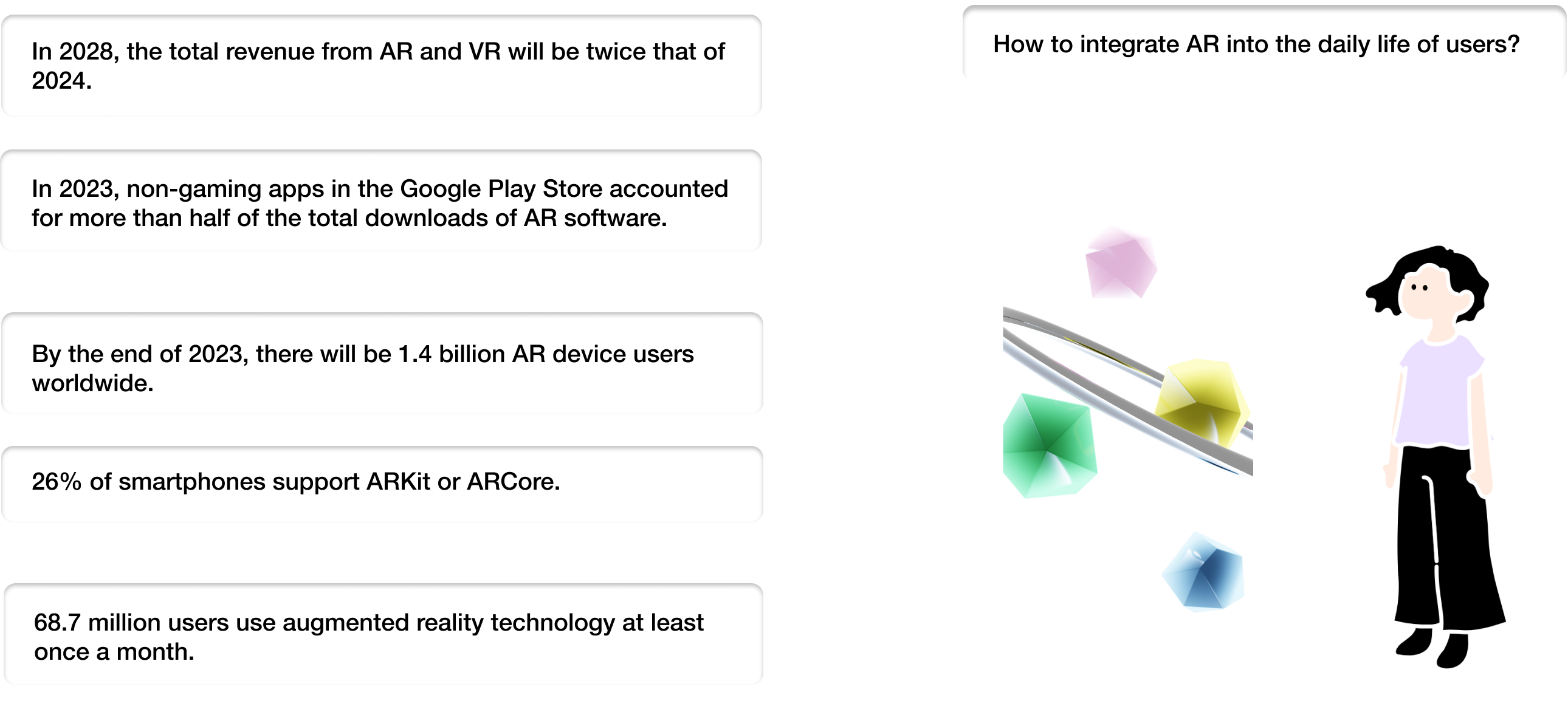
How can XR technologies jump outside of their niche position within the public recognition, and involves in our daily production and interaction with digital experiences?
Discover the context
︎Ideation
AR & Public Space?
The experience of visiting and living in many cities around the world, like Beijing, New York, Mexico City, Paris, Osaka, etc., inspires me a lot in how the design of shared experiences in multiple situations forges their uniqueness. Public art, either big installations or grafftis, always reveals the energy of the culture and community and bonds people together by the shared memory. Therefore, I developed this concept of combining pubic art and space with the usage of mixed-reality media that allows people to leave trace on the space and store that memory digitally. Literature review about public art and AR technology help me set up the theoretical foundation of such practices.
Define
︎Research
Data analysis
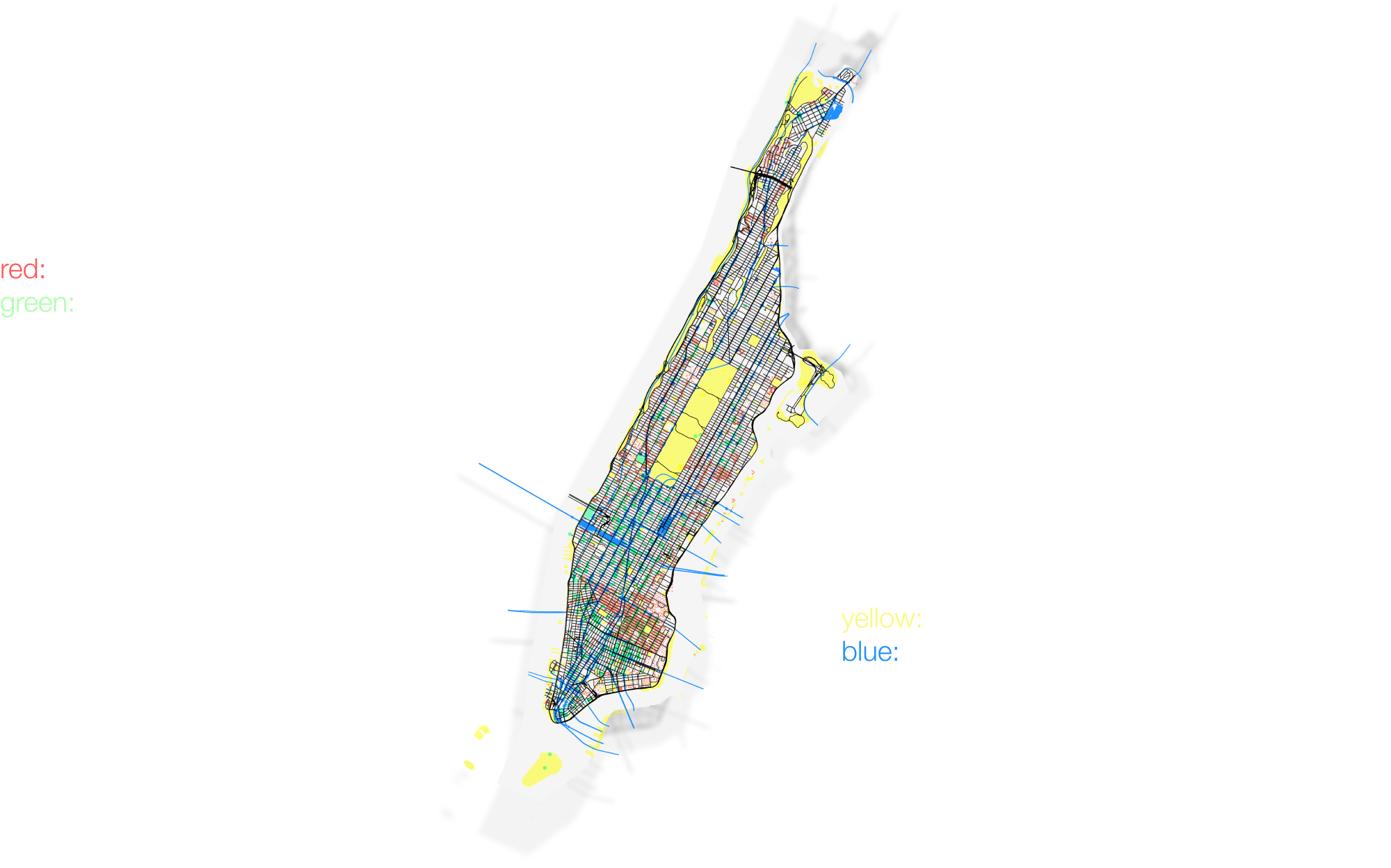
I have conducted researches upon this idea in ways like data analysis and quastionaires among my friends, and build data visualisations of city space distribution and mind maps about the emotion dimensions people are experiencing.
Competitor analysis
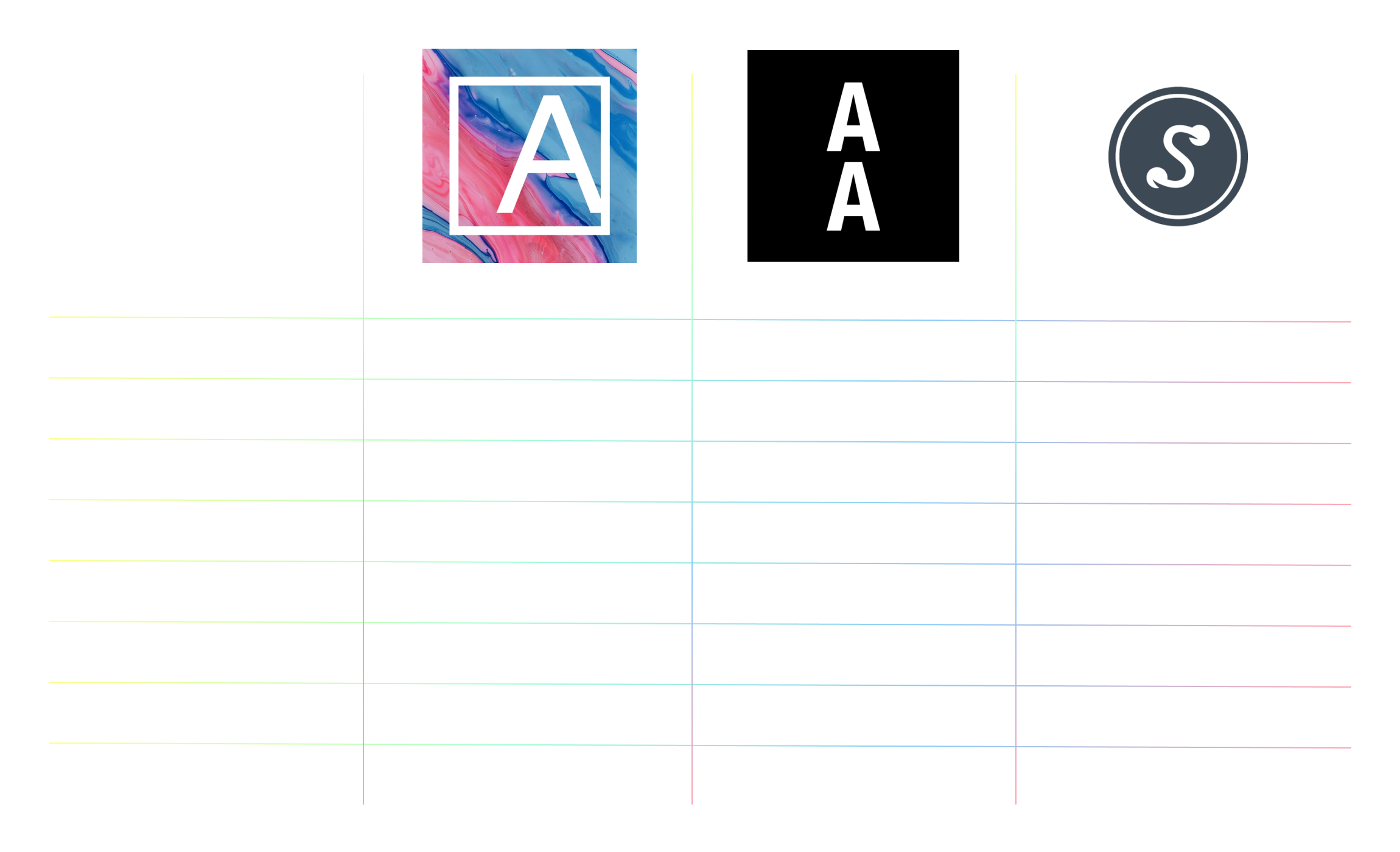
The platform analysis compares different AR creation platforms like Acute Art in their target audiences, interface designs, etc.
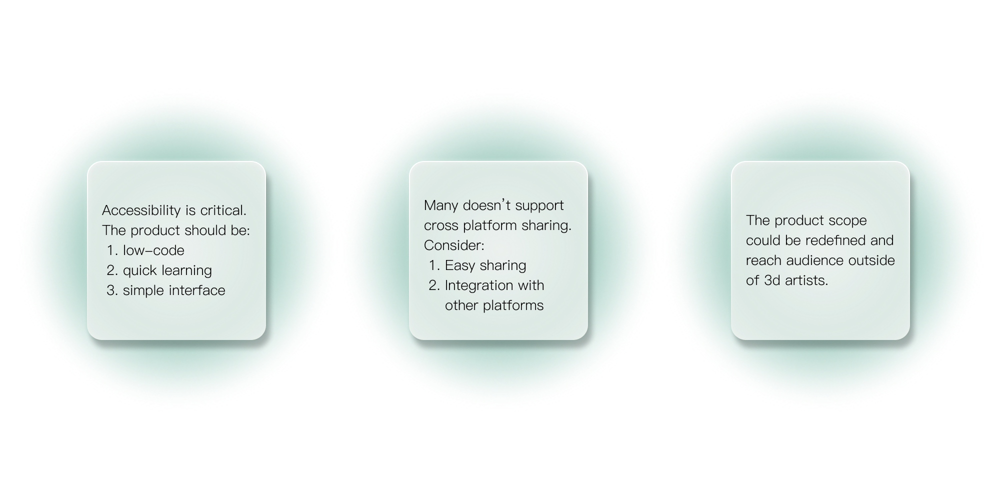
Conclusion
︎User Persona
Who would be interested?
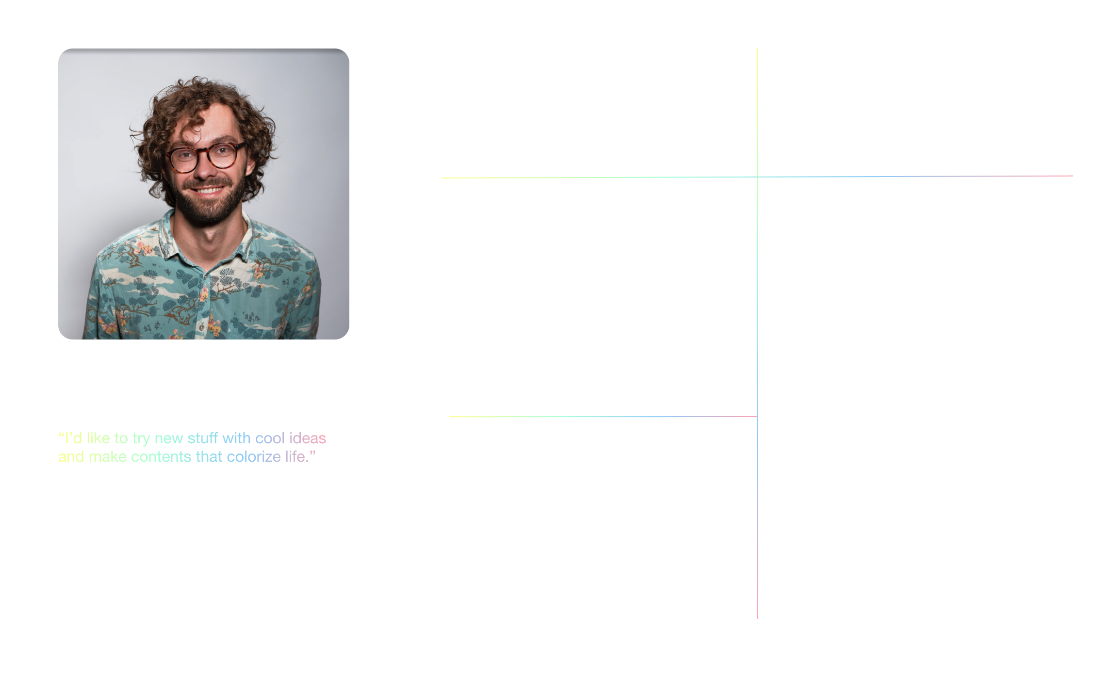
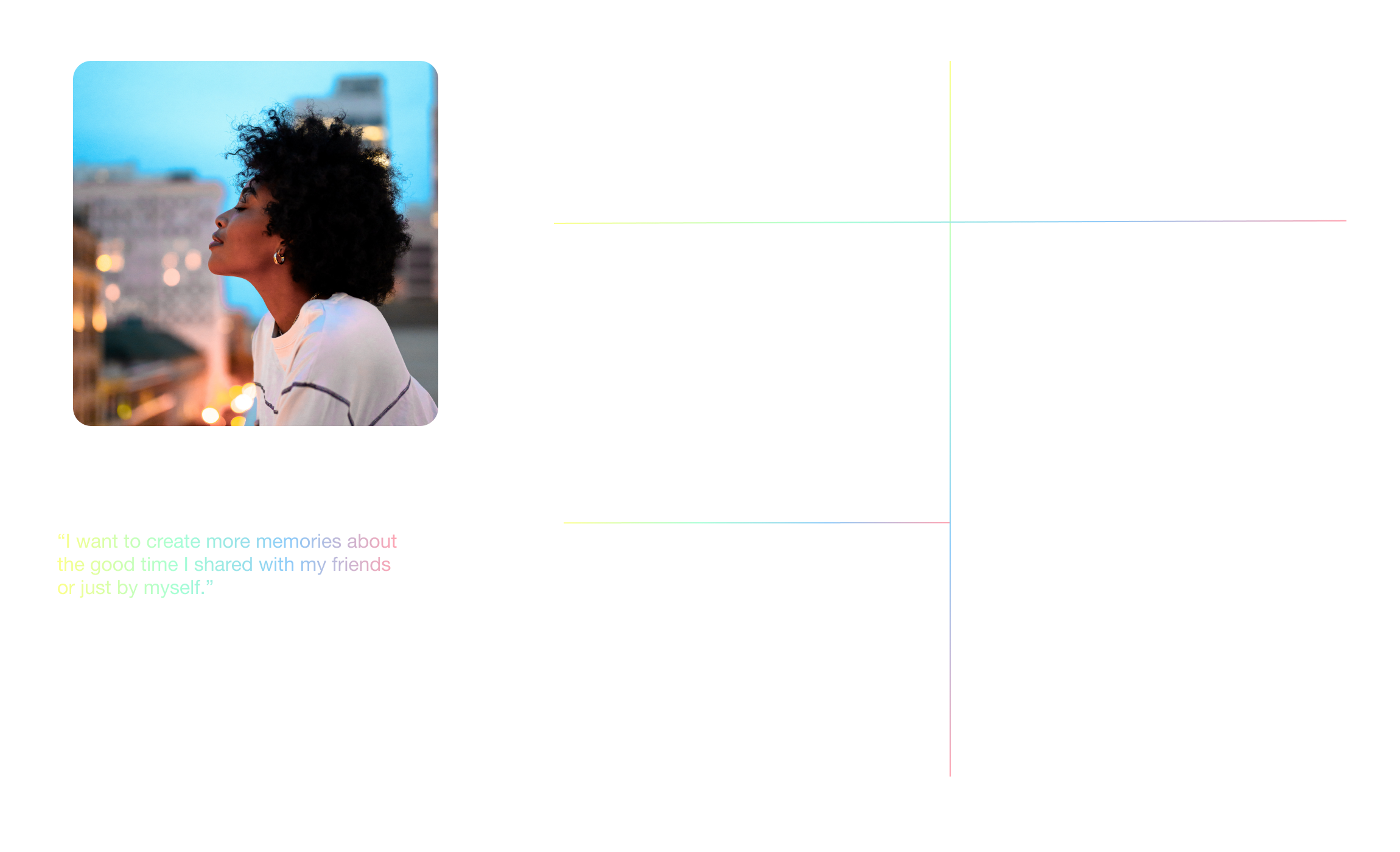
I created user personas from both the perspective of a potential content creator and potential user based on my observation from research results and the user groups of above apps. The personas represents who would like to try such experiences and their motivations behind, helping me to proceed with the following steps.
︎Design Approach
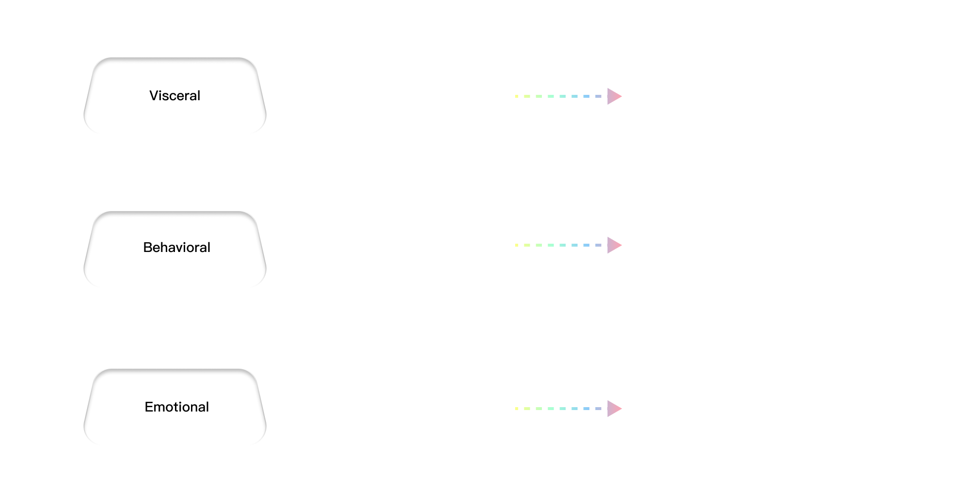
Emotional Design framework
︎Reframe
How to integrate XR technology naturally into our daily experience across situations and space, and make it a tool to fuel our relationship with digital platforms?
Concept
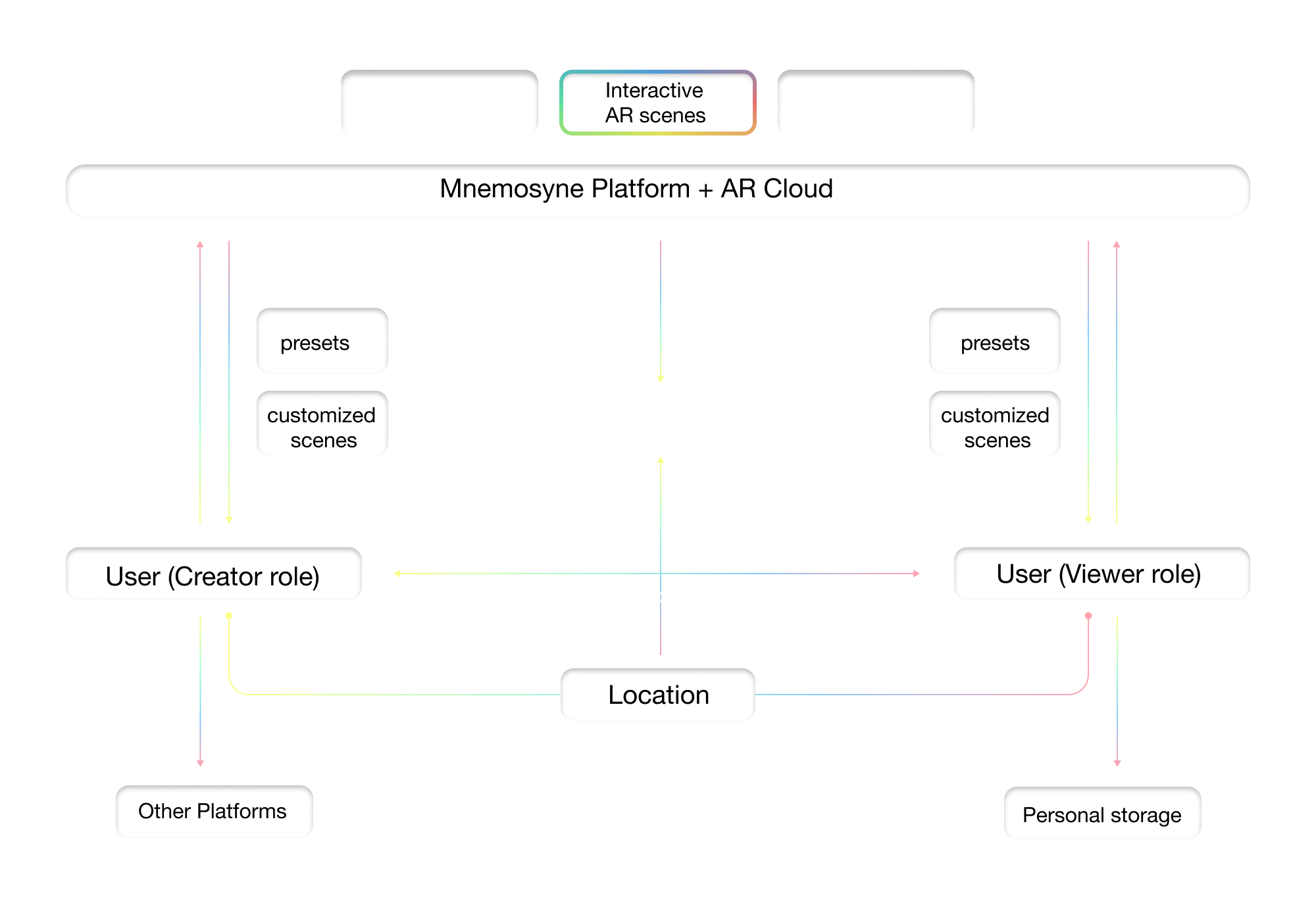
I would like the concept to be a product that applies and relates to many scenarios, instead of only a few of them (e.g. art galleries, tourist attractions), and is both user-friendly for people to explore and create. Moreover, an imprtant function is that they can add their own assets to a scene for others to view, including 3d objects, images, messages, etc., or use the scenes as a prop to create photos, both maximizing the interactivity of XR and implementing it with our usual demands.
Develop
︎Prototyping
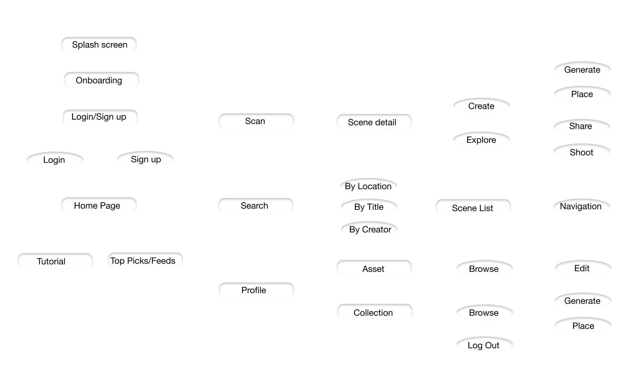
Information Architecture
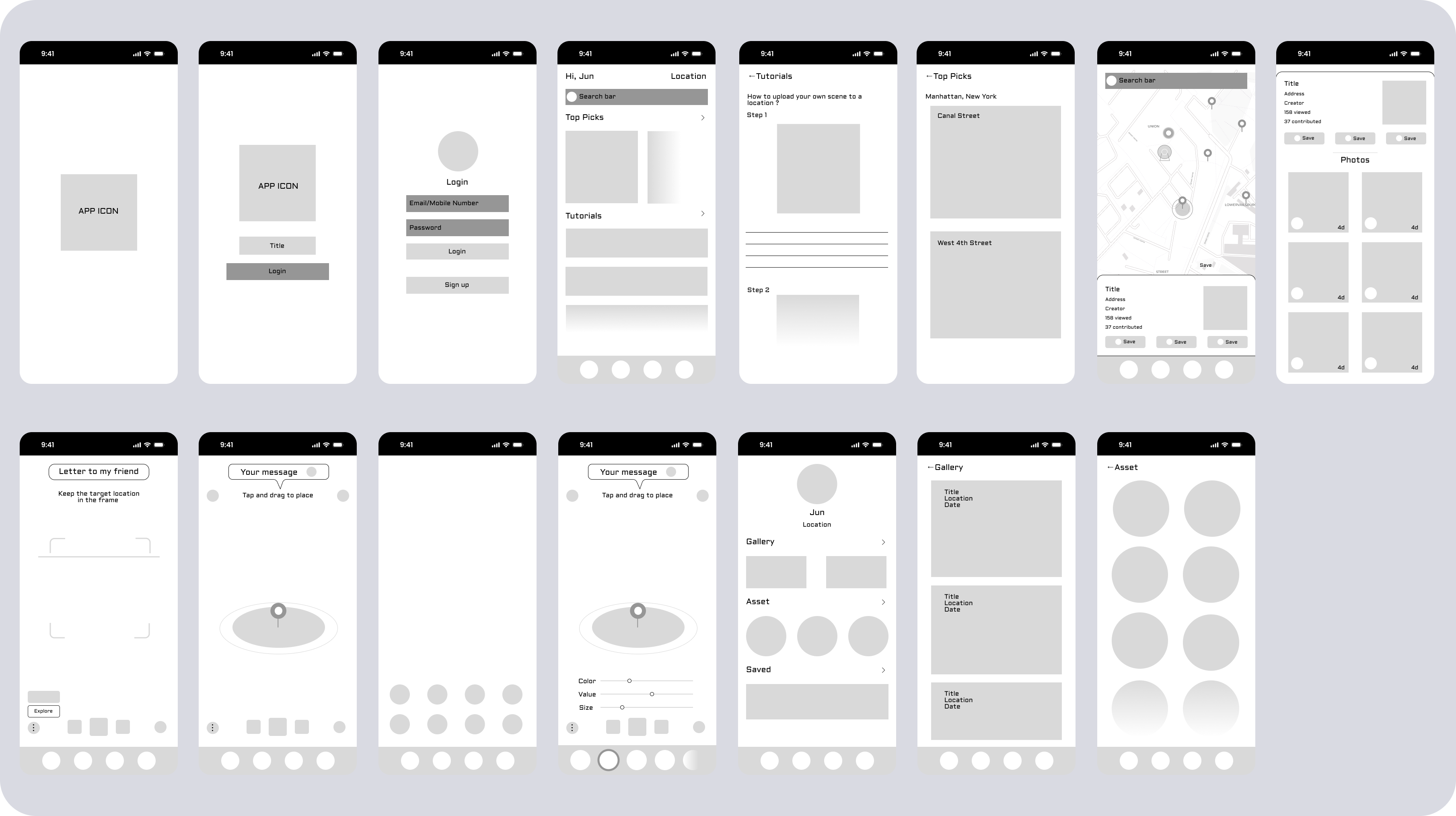
After analyzing the initial concepts and researches, I started to prototype the design. The main feature of the app builds around the AR function, which allows the user to detect AR scenes by location data, and create their own scenes. There are pre-made assets for users to use and adjust easily, so they don’t need to be experts in modeling and developing to enjoy AR (but they can still upload their own assets). The logic is similar to leave a graffti on a wall or a polaroid photo on a bar’s album. The core of the function would be to create and explore with accessibility, so people could use it as a tool for production. Other features that supports the AR experience includes recommendations of locations and feeds about AR and public art, a map function that navigate the users to their target scenes, and a personal gallery of scenes they visited and created.
Low-fi Wireframe
︎Design Element
Moodboaard
The visual style should be approachable and straighforward for users to navigate and browse through different content, with relaxing color gradients to indicate transitions and changes. Neumorphism is used to indicate the spatial experiences this concept would create and futuristic vibe of implementing AR in life. The elegance I found in multiple public art programs provides inspirations in a neat, friendly, and color oriented visual design.
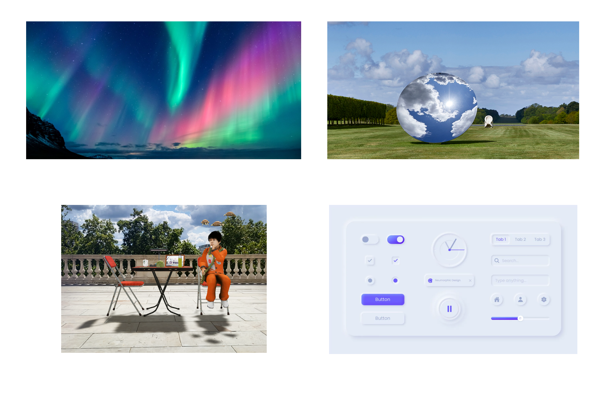
Visual element
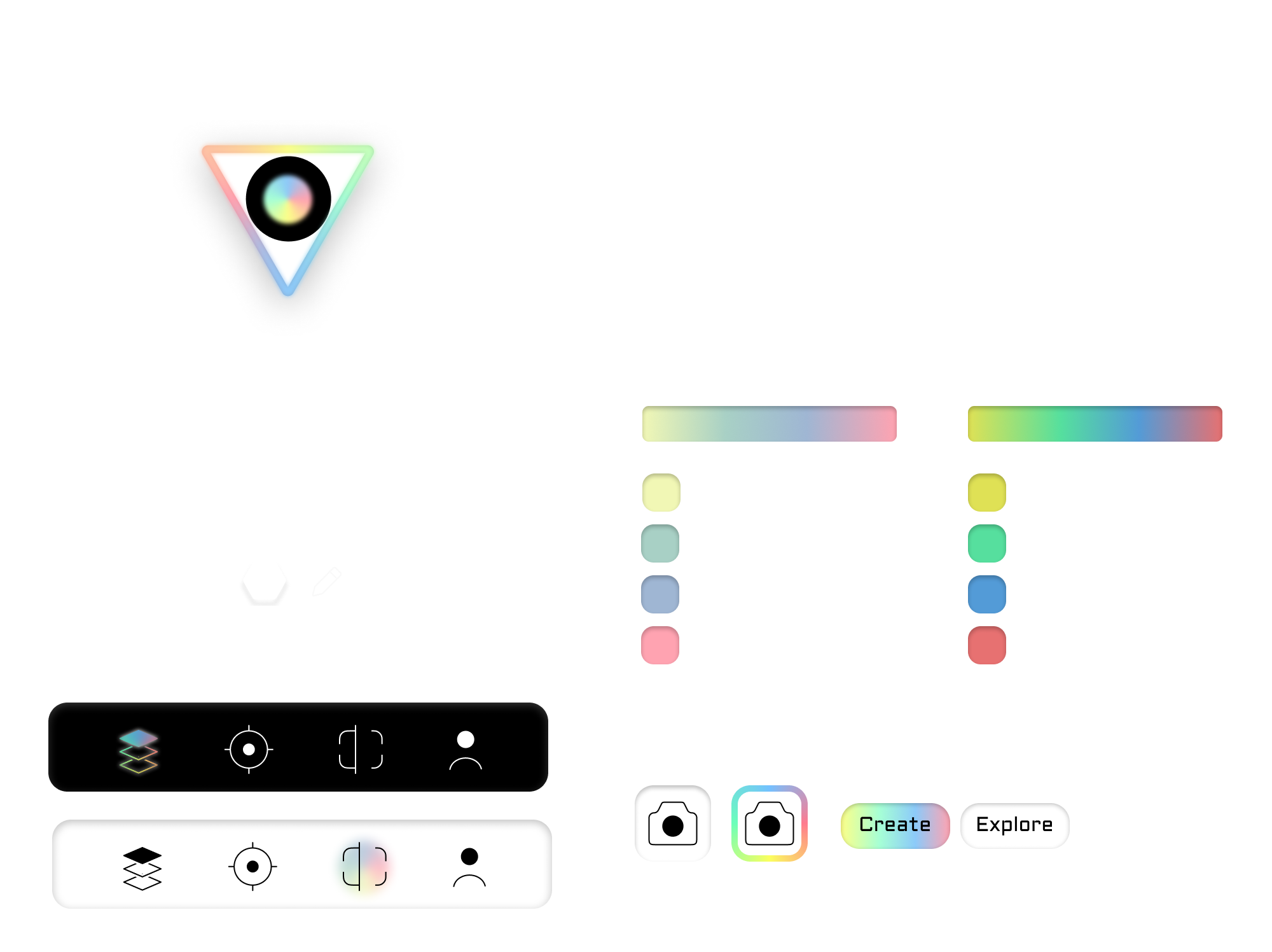
Deliver
︎Design Output
Final Screens
Several iterations are conducted to the high-fidelity wireframe prototypes in perspectives of accessibility, clarity, visual hierarchy, etc. The final screens polish some details in order to strengthen the visual identity and smooth the user experience, making it more up-to-date and consistent.
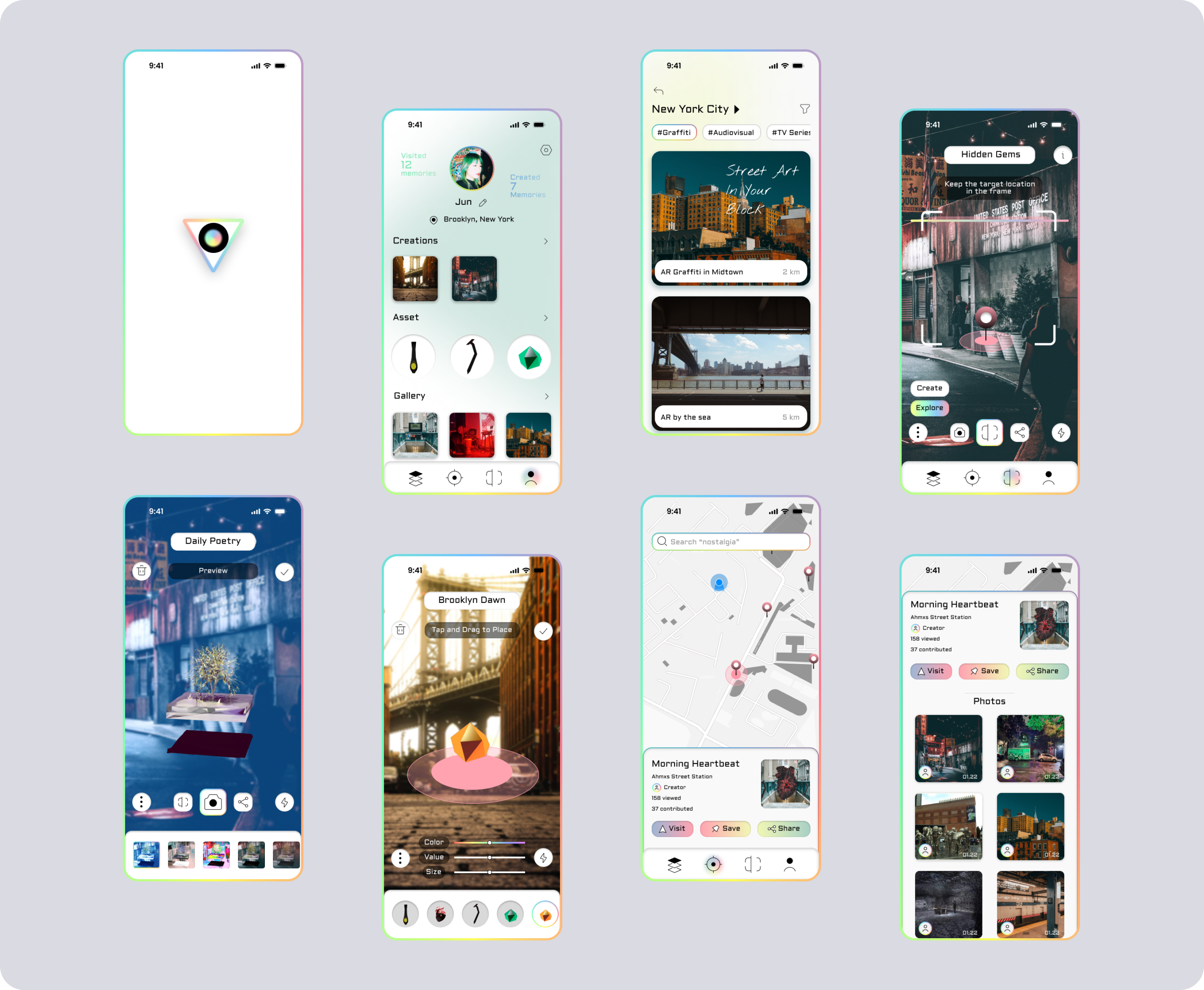
︎How do we...
Bridge user with creating smooth AR experience?
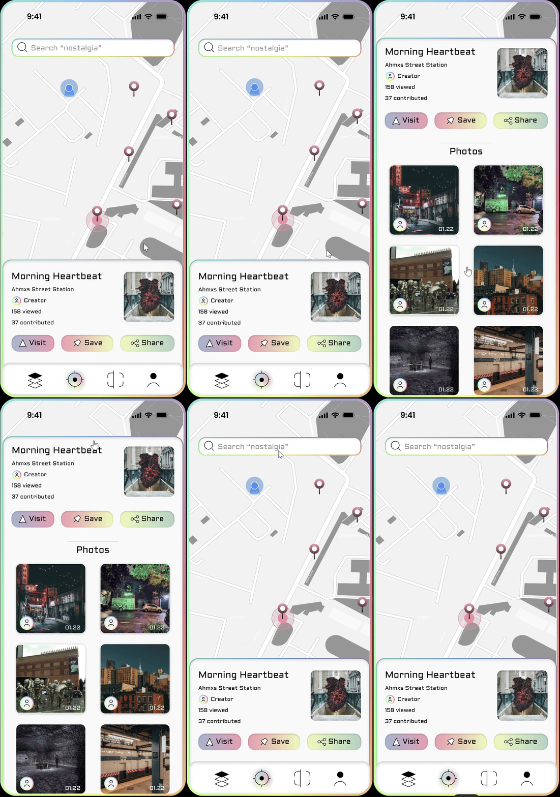
By providing feed feature we prepared the user a series of XR related background knowledge and outstanding creations.
The scan and navigate feature helps the user to locate the experience they are inetersted in and provide a seamless experience of scanning the AR piece.
Feed
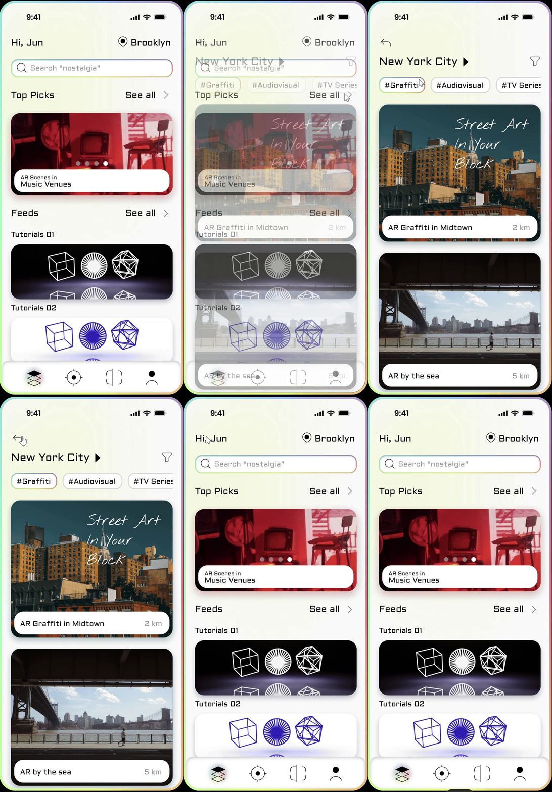
Scan

Navigate
Create
Record

Share

Empower user to enjoy both sharing and creating?
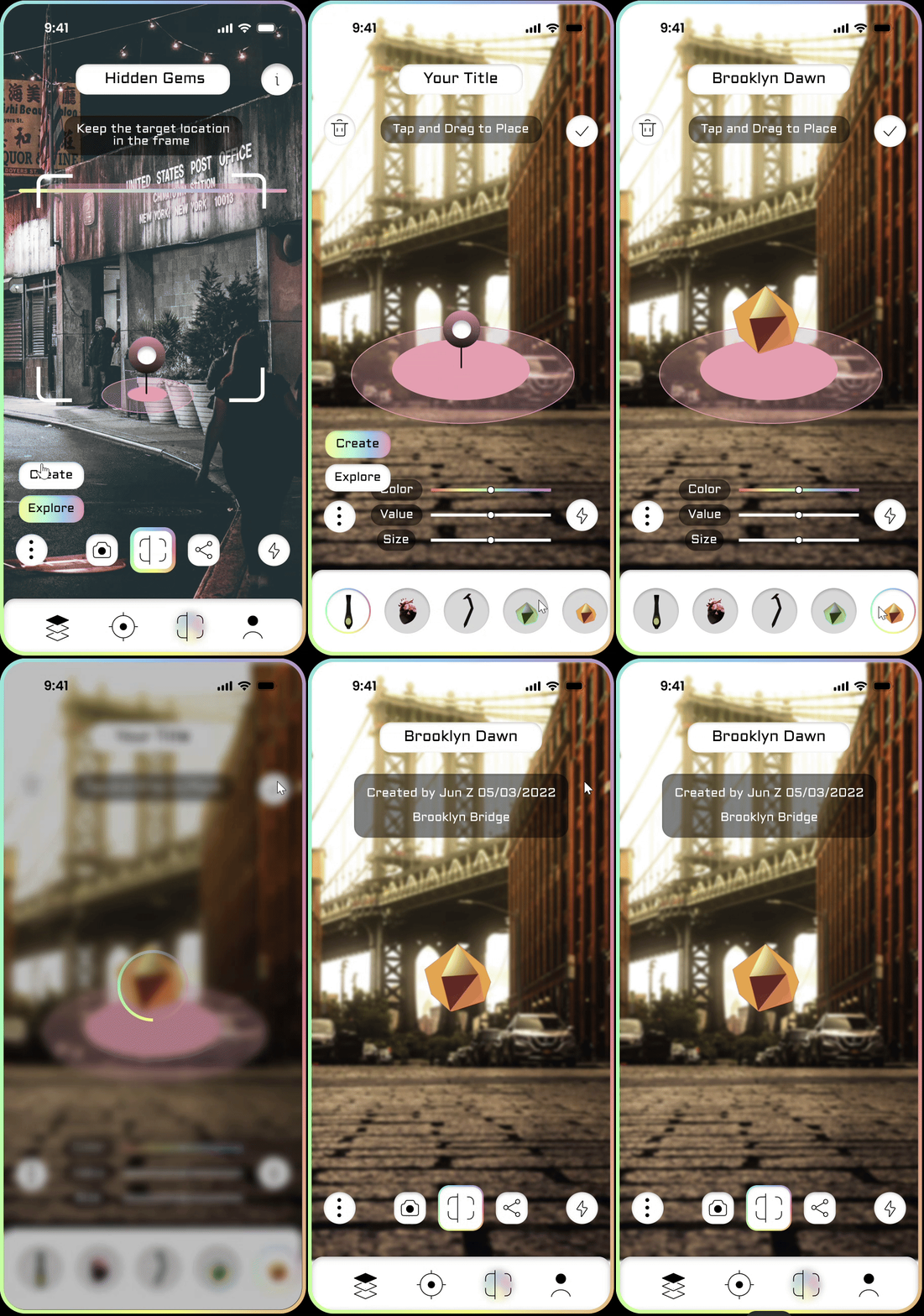
The user could easily switch between explore and create mode to view or upload creations. The share feature allows the users t easily share their experience with their connections.
Provide customized visually appealing experience to deliver emotional value to the users?
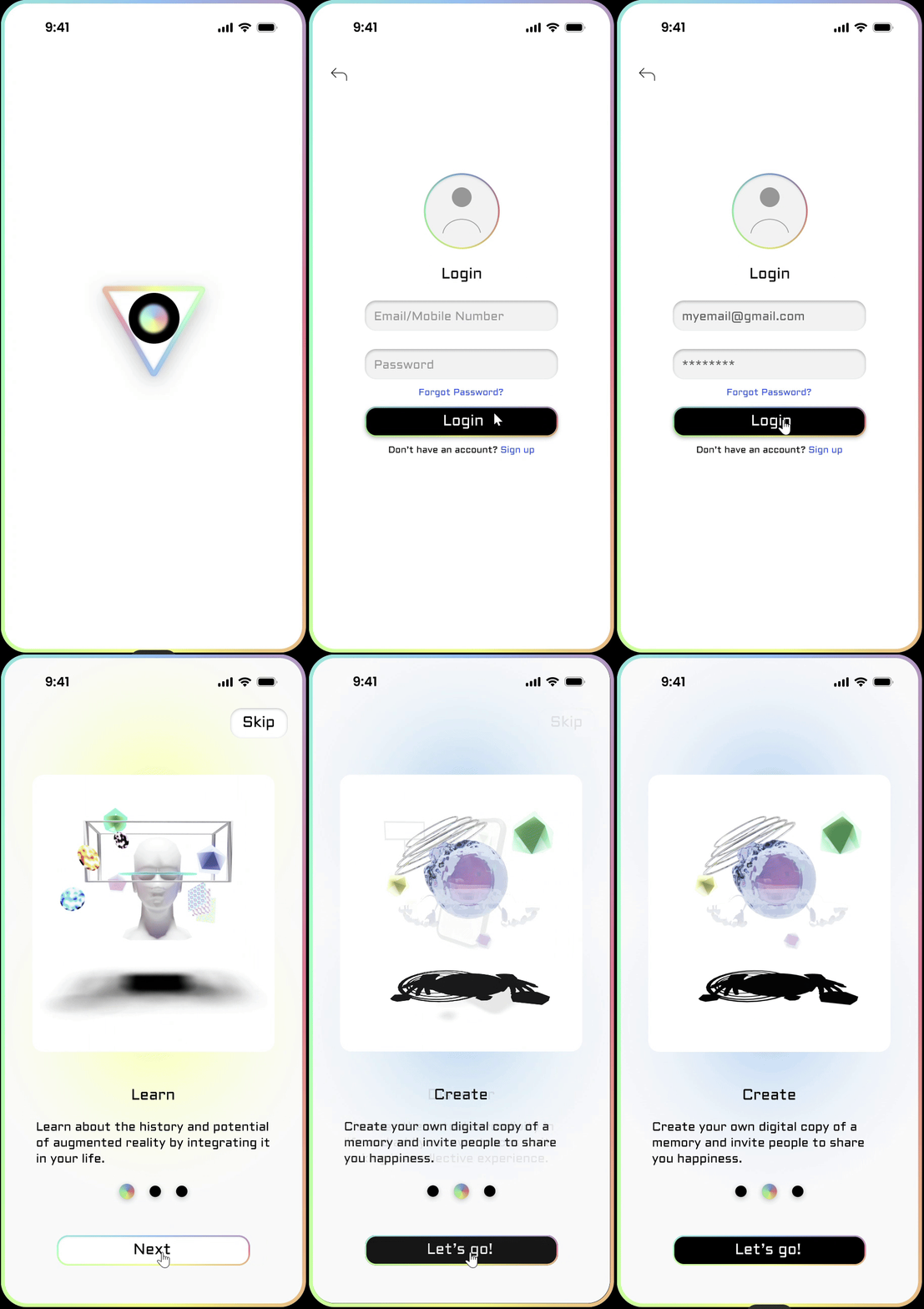
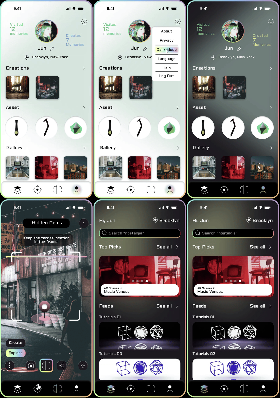
The onboarding navigates user to a new form of aesthetics in the XR world, while the dark mode gives space to the user to customize their experience.
Onboarding
Dark Mode
︎Reflection
Takeaways
Takeaway 1:
While doing research and testing the prototype of this project, I realize that XR is still a realm for vast experiment about the possibility of interactions. The process of wrapping up many functions in an information architecture and visualizes the design through interfaces is challenging but intriguing. I hope one day there will be a shared solution that provides guideline to designers and makes the experience between XR and other functions more seamless.
Takeaway 2:
From the perspective of design, what makes the users stick to a digital product without getting bored or frustrated by it? The consistency between the platform’s content, the brand identity, and ui/ux counts a lot. The harmony between those elements makes the experience pleasurable and relaxing, while only one or two of them standing out makes the experience laborious. Many digital experiences still lack maturity in achieving this balance, and this is an opportunity I can dig into.