Welcome!
Jun Zhou is a product designer|
With 2 years of experience, she makes technology easy to comprehend and collaborate with by creating empathic designs and data-driven impact. Curently at Parsons School of Design, exploring systems and playful media.
Previously @ByteDance @Infinigence AI
︎︎︎

Documentation Assistance Window
Helping users finding answers to technical questions frictionlessly
Product Design
Launched
Desktop
View Project︎︎︎

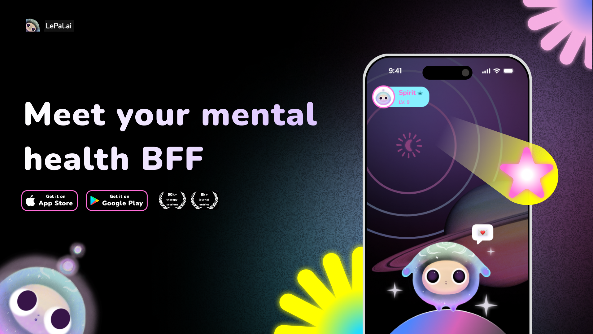
LePal.ai Redesign
Gamified mental health product for Gen-Z
WAU increased by 300% | 94% Positive Feedback
Product Design
Launched
Mobile
View Project︎︎︎